CALIFORNIA STATE UNIVERSTIY, LONG BEACH
GEOG 400
Geographical Analysis
Project: Detrended Correspondence Analysis
and Climate Change

Introduction

The purpose of this lab is to introduce you to detrended correspondence analysis, a multivariate technique that, like principal components analysis/factor analysis, works in that p-dimensional hyperspace you've come to know and love. Unlike PCA/FA, it works with data at a much cruder level of measurement: nominal data (categories with frequency counts, about as basic as you can get). In other words, it's kind of like Chi-square on steroids.
Most introductory statistics courses cover Chi-square, where you create cross tabs of one categorical variable on another (I've built a spreadsheet that will calculate Chi-square for you if you put your own data and standards in the yellow boxes -- you can get it at https://home.csulb.edu/~rodrigue/geog200/ChiSquareModels5.ods).DCA works with tables showing records down the rows and categorical variables across the top. The cells of the table can be frequency counts, including tons of zeros, or a calculated measure of relative abundance or importance. The data of interest are often the kinds of things that show a correspondence or association with an underlying factor but not a linear association. That is, the association is roughly quadratic in appearance, rather than linear. A linear association looks like the by-now familiar Y = a + bX form, which forms a nice straight line through the data cloud describing an association between variables. We've already seen that there are some crazy-looking associations that can easily be straightened out through one or another transformation (e.g., semi-log or log-log). There are, however, many non-linearizable associations out there, with variables that clearly correspond with others but which form a unimodal relationship, cresting (or even slumping) at some intermediate value and then falling off (or rising). Such a unimodal association would look like Y = aX2 + bX + c, the classic quadratic (or degree 2 polynomial), famous for one hump (or, if a is negative, a trough).
So, if you plotted your frequency or relative abundance against some other variable, you could get a perfect association but one where one variable rises with the other up to some point and than reverses direction and falls off as the first one keeps rising.
Such data can't validly be used for PCA/FA:
- PCA/FA assumes scalar data that are reasonably normally distributed.
- PCA/FA searches for linear associations between variables and between real variables and the "fake variables" or components it extracts.
This issue has been especially vexing to ecologists and biogeographers, who have been keen to reduce the complexity of community changes across environmental gradients. They would love to use PCA/FA for ordination (zonation of ecological communities along one or more environmental gradients), the way you were able to perform zonation on the Mars geochemical data from the Spirit rover. They are stuck with nominal categories (e.g., species) and frequencies or relative frequencies and the huge headache of non-linear associations.
Species are chacterized by zones of optimal adaptation, zones of tolerance, and zones from which they are excluded by such factors as extremes of temperature, humidity, selenium concentration, nitrogen availability, lighting, and so on. In other words, each species' frequency or relative abundance scales up with these factors up to a point and then starts declining. A critter may be unable to tolerate temperatures below 4° C, may tolerate temperatures from 4-10° C, really thrive between 10 and 25° C, start stressing out in warmer temperatures from 25-33°, and be unable to survive above 33° C. Another species might show that same pattern, but with different temperatures, with narrower or wider optima or tolerances. So, if you looked at a temperature axis and placed species along it, you would see different collections of species at different temperatures and be able to define communities of critters at various points along that temperature axis. Imagine all the other factors important to each species and the unimodal correspondences between each factor and each species. It would be great to have some technique to reduce the dimensionality of this problem, so you could classify communities by environmental "envelope." If you tried to run a PCA/FA on these data, you would get components that are not cleanly orthogonal: They wouldn't produce a horizontal line paralleling the X axis, indicating that Y had no connection with X (no variation in X could affect Y). In fact, they would be arched like the underlying unimodal associations but with a vengeance: PCA/FA creates arches so extreme they actually sometimes bend in on themselves at the ends, kind of like a horseshoe. Try interpreting that. Here's an example image of the arch effect. Nasty!
Ecologists and biogeographers have, therefore, been out in front in trying out other multivariate methods to reduce the complexity of their databases. One approach is something called correspondence analysis. This can happily deal with categorical data, but you still wind up with that arch effect, where axis 1 loops onto axis 2 instead of being straight and orthogonal. It also tends to bunch the data points tightly on either end, so you can't really make out what the species are responding to. It's still hard to interpret.
Well, in 1980, M.O. Hill and H.G. Gauch came up with a way of tweaking correspondence analysis into producing orthogonal and straight line associations among species and the implicit environmental factors. No more bleeding of axis 1 onto axis 2. It entails taking the plot of factor scores on axis 1 and axis 2 (rarely axis 3) and segmenting the arch into, usually, 26 segments running along axis 1. Within each segment, the mean score on axis 2 is calculated just for that segment and then standardized so that all segments have the same standardized score. Then, you move each segment's 0 score to align with its neighbors', stitching together a straight line where the data points in each segment are distributed pretty symmetrically above and below the 0 point for that segment. So, when you draw a line through the standardized means for all the segments, you produce a straight, horizontal line line orthogonal to the Y axis. No more arch. This also spreads out the dots on either end of the distribution. The whole thing comes out more symmetrical and it winds up being easier to interpret, kind of along the lines of how you interpreted the extracted components in the Mars PCA/FA. You figure out the high and low scoring records or variables (species) and use those extremes to figure out what the axis is about. This new technique is called detrended correspondence analysis or DCA. I found a pretty nifty video animating the process of detrending an arched correspondence analysis trend: https://www.youtube.com/watch?v=OHMf42Sy6KM .
One cool thing about this is that, in the case of biogeography/ecology, you can get at critical environmental factors indirectly just from the changes in species frequency or relative abundance over space or through time, even if you don't have any other data on these environmental gradients. If you have some data representing various environmental gradients, you can compare their trends in space or time with the axes that emerged from your species counts or abundances. Because zonation can be done across space or time, more and more geologists, palæoclimatologists, and archæologists are becoming interested in DCA, too. I think the technique might eventually diffuse out into other disciplines, such as human geography or economics, which sometimes have to deal with unimodal associations as well.
Zonation across ecological space is usually called ordination. Zonation down through time is usually called seriation. Ordination and seriation are essentially the same tasks (zonation), but one is spatial and the other is temporal.
The PCA lab was spatial, a geomorphic zonation problem (which a biogeographer or ecologist would think of as ordination). For the DCA lab, let's switch to seriation.
You can do other nifty things with DCA, too, not just zonation/ordination/seriation. You can cluster species (or whatever) by their distances from one another in this p-dimensional hyperspace and find out which species tend to hang out with one another from that "spatial" clustering and reconstruct typical species assemblages in space or time. You could use this in archæology to figure out cultural complexes of artifact types. I suspect there may be applications in human geography and other social sciences, wherever you find variables that show this unimodal (or uni-depression) kind of association with other variables (e.g., people's willingness to buy earthquake insurance rises with income up to a point and then falls off).
The goals of this lab are to:
- have you do a DCA
- have you apply DCA to a seriation/ordination/zonation problem
- (re)acquaint you with the (free) multivariate statistics package, PAST (only PAST; the original Hill and Gauch FORTRAN program, DECORANA; and now the open-source R project can do DCA as far as I know)
- give you practice moving data between PAST and Excel (Calc doesn't integrate with PAST, so we'll use Excel to get data into PAST, though we'll switch back to Calc for graphing)
- build on your familiarity with correlation analysis as you figure out the meaning of the DCA axes
- to acquaint you with a very interesting time of great climate change: the end of the last Pleistocene glaciation and the tumultuous shift to the Holocene Epoch (during which humans developed agriculture, settlements, cities, and our current technological life)
- to introduce you to an impressive palæoclimatological data set coming out of a lake on the west coast of central Japan.
Project deliverables are:
- Calc (or Excel) graph of the scores of the first two axes through time, divided into four (or, optionally, five) time zones, "autographed" (as in make sure I know whom to credit!)
- Line graph with two higher order polynomial trend lines smoothing the data (okay to put on first graph)
- brief statement identifying the environmental factors that the first two DCA axes are picking up on and the timing of several shifts in the climate record of Lake Suigetsu during the Pleistocene-Holocene transition, "autographed" (this can be worked into the table described below or turned in as a separate Writer file)
- 2 x 2 matrix showing the 4 correlations (R) of your axis scores and environmental factors, "autographed" (so dinky that "table" seems too dignified a title)
- two scatterplots:
- summer precipitation in mm (X) and Axis 1 (Y)
- coldest month temperature in ° C below modern levels (X) and Axis 2 (Y)
- table of your four (or five-ish) zones by name and duration in the Suigetsu data, "autographed"
About the Data and the Problems They Address
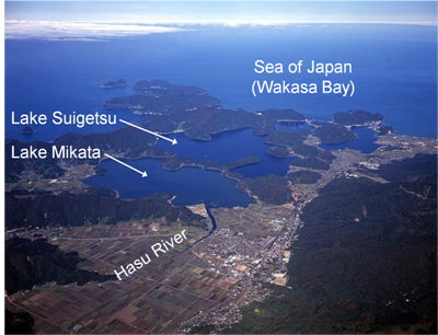
Your data set this time consists of 369 records. Each record is a sample taken in summer 2006 from four parallel cores extracted from Lake Suigetsu on the west coast of central Hokkaido, Japan. Here is an (overhead view of the small lakes), so you can see how Lake Mikasa shelters Lake Suigetsu from upstream "excitement." The four cores overlap one another to ensure data continuity (compensating for chance disturbances at any one location on any one core). The result is a composite record going down 73 m in water 35 m deep! Much of the composite core is varved, which means that it shows rhythmic layering, recording seasonal changes in lake deposition. Here is an image of varves in the core:
![[ Lake Suigetsu varves ]](https://home.csulb.edu/~rodrigue/geog400/graphics/VarveImageSuigetsu.jpg)
This rhythmic alteration in color and texture is characteristic of the last top 46 m or the last 60,000 years. This marks the transition of Lake Suigetsu to a lake with very still waters and anoxic conditions at the bottom. Such lakes preserve a record of each summer's growth of diatoms (algæ that produce siliceous cellular structures) when they settle after death. Their pathetic little light-colored siliceous remains aren't disturbed by the actions of larger bottom-dwelling critters, because there is little to no oxygen down there. Each species' siliceous "thecæ" pattern is unique and allows them to be identified. Also, drifting down to the bottom is pollen from the vegetation surrounding the lake, which changes due to climate conditions (and, now, human activity). Pollen, or fine dust like structures that produce plant sperm, is also highly identifiable and it's well-preserved in the anoxic bottom muds.
Each autumn, the lake water overturns as the surface cools to its maximum density temperature (just above freezing) and sinks. This alters lake bottom deposition to add darker iron carbonate on top of the diatomaceus and pollen rich sediments.
The lake creates varves because of the quiet, anoxic conditions at the bottom. This situation arises because Lake Suigetsu only receives water and terrigenous sediments from Hasu River through a lake right next to it, Lake Mikata, which basically filters the water. The two lakes are connected with a very shallow and very narrow short channel, which means only really fine sediments can get from Lake Mikata into Lake Suigetsu and Lake Suigetsu is protected from high energy disturbances, such as floods, by the prefiltering function of Lake Mikata. So, this is an unusual situation allowing really detailed varving.
If you'd like to know more about the Suigetsu Varves project, you can visit https://www.suigetsu.org. If your browser says that the site is a danger, you can safely disregard that -- I think they haven't updated security certificates in years.
So, your database consists of 369 subsamples of this composite core, covering regular intervals (roughly 15 years long) between 10,216.6 years ago (calibrated radiocarbon years before 1950) and 15,700.6 BP. For each of these records, you have counts of pollen grains from 109 different plants (usually identified down to the genus level, but some are at the family or species level -- whichever level allows you to recognize a particular pollen grain). Each plant species or group has a particular set of environmental conditions that are optimal for it, so collecting pollen allows for some indirect inference about the range of temperatures or precipitation or light available in a given site. Figuring out these optimal environmental envelopes for 109 species could get tedious! That's where DCA comes in, allowing you to group species/groups along a couple of underlying factors, observing these factors or "axes" as they vary through time, figuring out which axis reflects which environmental gradient, and then inferring climate change at Lake Suigetsu during the bumpy ride of the Pleistocene to Holocene transition!
I have also thoughtfully provided two columns of environmental data presented by the Suigetsu research team (they are doing all kinds of analyses on this combined core, not just pollen studies).
Getting the Data and Processing Them
Your pollen and environmental data are available as a Calc spreadsheet: https://home.csulb.edu/~rodrigue/geog400/DCApollen.ods. As usual, click to download the file to your flash drive or wherever you've decided to park the file. Open it in LibreOffice to have a look at it and then immediately save it (you can't do anything with the file until it's been saved somewhere).
Now, save it again as an Excel file. You are probably safest saving it as an Excel 97/2000/XP (xls) file (not as an xlsx file). So, you now have an original copy of your data safely stowed and a second copy you'll use to move the file into PAST, insurance in case something doesn't go right.
Having saved it as an Excel file, close it. Now, fire up PAST 4, and then open the Excel version of your spreadsheet. You'll get a "Form 1" dialogue box asking you if there are nothing but names and data in the row contents and in the column contents. Click OK and make sure the first row of variable names came into PAST as names in the grey boxes. (If so) Immediately save it as a PAST native file, DCApollen.dat (and most versions of PAST need you to write in the .dat extension for some reason). Then, i f so, click the fourth column, which should be Cryptomeria. Then, scroll allllll the way over to the last critter, Spore-trilete. Hit shift and then the grey box labeled Spore-trilete. All those 109 columns should be highlighted.
If so, click the Multivariate tab up top and select Ordination and then Detrended Correspondence in the menu that comes down. A box with a scatterplot of Axis 1 and Axis 2 comes up. You can fiddle around in here to see various effects. You might try unclicking Detrending to see the arch effect. You can look at the Axis 2 and Axis 3 scatterplot (kind of random). With Detrending checked, you can play around with different numbers of segments and watch the dots move around. You can label row dots by sample number or column dots by species names. You can fit an ellipse around the row dots to see the region defining the association between the two axes at the 95% confidence level. You can hit the Copy button at the bottom and paste your scatterplot into Calc (which you are free to open again once you've had PAST save your data as a PAST native format file, a .dat file). When you're done messing around with the options, go back to the default settings: Row dots, Detrending, and 26 segments (kind of the norm in the evolving DCA users community).
Now, click the Row scores tab. A table of DCA scores for the first three axes (or components in PCA-speak) comes up showing the DCA scores for the 369 subsamples along the core. If you're curious, you can also look at the Column scores, which shows you the DCA scores for each of the 109 pollen types (you could do vegetation community analyses with these). We're interested in the row scores to evaluate change through time. Now, hit the Copy button at the bottom of that dialogue, so you can get the row scores into Calc.
Re-open your Calc file. Let's make room for the DCA scores. Highlight Columns D, E, F, and G and insert columns there (four). You'll need four for three columns of data, because PAST will include the identifiers (SG_vyr_BP).
Back in PAST, click the Copy button on the bottom of the Row scores tab in the DCA box. Back in Calc, paste this into cell D1. Scrolling down, you should see record numbers ending in cell D370 (if they don't, do a Control-Z and try pasting it again, but this time in cell D2). You don't need the second copy of the identifier column, as it's already in Column A. So, it's best to highlight Column D with those dates and then delete the column. Now, you have Axis 1 in Column D, Axis 2 in Column E, and Axis 3 in Column F.
Let's graph DCA scores by subsample record. Highlight the SG_vyr_BP column and then the Axis 1 and Axis 2 columns (don't bother with Axis 3: It's pretty random and will just clutter up your chart and get in the way of your analysis). Create a line chart of Axis 1 and Axis 2 by SG_vyr_BP. You should ask for the X axis to be in reverse order, so that the older records (~15,700 BP) are on the left and the younger records (~10,200 BP) are on the right. You'll also need to move the Y axis from the right side to the left side after you reverse the time scale. Each of the two lines should show small dots and thin lines between them (so you have some formatting to do).
The resulting chart will be busy with jagged oscillations in the two components through time, reflecting the variability in the two climate factors DCA has picked up on. LibreOffice Calc has a cool function: higher-order polynomial trend lines. Let's smooth the trends in the spiky lines by fitting a trendline to each one, but pick a polynomial trend this time, not the linear or logarithmic ones you've already met in Calc.
A polynomial equation comes in various degrees. You met the 2nd degree one earlier in this lab, the one that includes X2 in it. The 3rd degree would add X3 to the mix, the fourth would add X4, and so on. The resulting curve has one bend fewer than its degree, so a 2nd degree polynomial (the quadratic) has one hump or dip. You get the idea. So, you can ask Calc for any degree (the 6th would look like Y = aX6 + bX5 + cX4 + dX3 + eX2 + fX + g. And you, optionally, can ask it to print out the equation and the correlation coëfficient (which you can format to a decent number of decimal places). Try it out. Which one seems to fit your curve the best? If you do this in the original line chart (not a duplicate), be careful to format the trendline thicknesses and transparencies to show the line but not obscure the original spiky lines.
Now, you're in a spot to figure these factors out and their trends through time. Think about what you know of the Pleistocene-Holocene transition, the end of the ice ages and the advent of modern conditions. Which of the two trendlines seems to show an increase through time, the signal of (irregularly) warming temperatures?
If one of these is temperature-related, what do you suppose the other factor is? Think about weather reports. What do they report besides temperatures? So, you have testable hypotheses. Let's see how they fare against actual environmental gradient data (columns B and C).
Somewhere convenient, create a small table with two data columns and two data rows. Let's say you set this up starting in cell A375. Cell B375 would be ColdestR (for coldest month's average temperature in degrees below modern averages) and cell C375 would be SumPrecR (for mean precipitation in the summer half of the year in this monsoonal climate). These are environmental variables that represent measures of temperature and precipitation, respectively.
In cell A376, enter Axis 1; in A377, put Axis 2.
In cell B376, enter =correl(d2:d370;c2:c370) for the correlation between temperature and Axis 1.
In Cell B377, enter =correl(e2:e370;c2:c370) for the correlation between temperature and Axis 2.
In cell C376, enter =correl(d2:d370;b2:b370) for the correlation between precipitation and Axis 1.
In Cell C377, enter =correl(e2:e370;b2:b370) for the correlation between precipitation and Axis 2.
Is the allocation of high and low correlation coëfficients in the direction you hypothesized? In other words, did you guess correctly which of the axes has to do with temperatures and which with precipitation?
Do two scatterplots:
- Summer precipitation in mm (X) and Axis 1 (Y)
- Coldest month temperature in ° C below modern levels (X) and Axis 2 (Y)
Zonation/Seriation/Ordination
To figure out what you're seeing on the DCA by varve years chart, you need to do online searches on the following terms, in each case trying to figure out when the events happened (try for calibrated dates before the present):
- Oldest Dryas stadial
- Bølling-Allerød interstadial, sometimes subdivided into the
- Bølling oscillation
- Older Dryas stadial
- Allerød oscillation
- Younger Dryas stadial
- Preboreal
These events are changes in climate behavior during the transition from the Pleistocene Epoch to the Holocene or Recent Epoch in which we live. They were originally based on palæoclimate data from northwestern Europe, such as pollen caught in Danish bogs. As data were collected from more and more regions and of different variables, it became clear these were not "local yokel" events but were connected with climate changes all over the world. Events elsewhere sometimes parallel the European events, perhaps offset a bit due to lags in the global climate system, and sometimes trend in very different directions (the southern hemisphere is particularly distinct). A lot of progress has been made in understanding physical mechanisms that may underlie these events (e.g., there was a large freshwater surge into the North Atlantic when the melting of North American glaciers accelerated and there was a shift in where the freshwater joined the ocean. This caused a slowdown or actually stopped the thermohaline circulation. The thermohaline slowdown/stop occurred as cold ocean water became less dense with the decline in salinity, and this triggered the abrupt and extreme cold of the Younger Dryas event as warm subtropical waters were no longer pulled toward Europe, an event with signals seen as far away as Japan!).
So, that's the context of the Suigetsu project. Now that you've learned about and timed the stadial/interstadial events above, you can go looking for them in the Suigetsu DCA scores on axis 1 and 2.
Try dividing your chart into four zones, based on the average and relative elevation of the two axes' DCA scores and their degree of variability (spikyness). In this, do not use the polynomial trend lines (I just wanted you to know about complex trendlines!). Use the two original axial score lines (the bumpy, somewhat chaotic lines). Look especially for the very beginning of trends upward or downward, particularly on Axis 2, the last high date or the last low date (you can get the date by activating the chart and then hovering your cursor over game-changing dots). Record the date and drop a vertical line down to the X axis.
You should easily make out the Oldest Dryas, the Bølling-Allerød (especially the warm and stable run of the Allerød oscillation), the Younger Dryas, and the Preboreal. You may be able to spot the Older Dryas, too, though it's harder to see and there are two similar events behind it on the timeline. Label your zones (and you can write in the Older Dryas if you see it, though that's optional).
Create a table showing your four main time zones as rows, identifying them by name. In each row, show the beginning dates and the ending dates you found for them online, the beginning dates and ending dates you found in the Suigetsu data, and a brief comment on why you picked the particular dates you did. So, you have four rows of information and six columns. Make sure the end of one zone has the same date as the start of the next one in the online dates and in your own Suigetsu dates.
So, just by using DCA to process the frequency counts of 109 pollen types caught in the varves at the bottom of Lake Suigetsu, you've been able to figure out the underlying climatic factors driving the movement of species into and out of the area and then use those two factors to pick out global climate change signals during the Pleistocene-Holocene transition!
You can do other things with DCA, too (but I won't put you through them!). You can sort species by axis scores to figure out when species enter and leave an area depending on their environmental tolerances. You could run the species' DCA axes through K-means clustering to figure out associations of plants. You can graph each species' location in the ecological space defined by the two axes to cluster them, too. If someone's at a dead end finding data for the final project, this part of this database might work for you!
GEOG 400/500 Home | GEOG 400/500 Syllabus | Dr. Rodrigue's Home | Geography Home | ES&P Home | EMER Home |
This document is maintained by Dr.
Rodrigue
First placed on Web: 03/28/12
Last Updated: 10/31/23