Geography 200: INTRODUCTION TO RESEARCH METHODS FOR GEOGRAPHERS
Dr. Rodrigue
Graded Lab 8: Introduction to Correlation and Regression

This lab introduces you to the bivariate analysis of scalar data (interval or ratio grade data). The techniques you'll meet here are correlation and regression. Simple linear correlation and regression (there are methods for handling un-simple curvilinear associations, but I digress). Hot off the press, we're going to use the presidential election results for our data set.
Go on ahead and download your data set from https://home.csulb.edu/~rodrigue/geog200/election2004.ods. Your browser may warn you that there is a possible security hazard here (Dr. Rodrigue, Hacker @ the Beach?). It will ask you what you want to do with this file. Select "Save it to disk" and then specify your floppy or flash drive. Then, you can just open it in OpenOffice Calc. You will see that I've included 12 variables, the abbreviated names of which are defined at the bottom of the spreadsheet, and the sources of the data. Note that two columns are identical: "%kbo Bush." This is because I'm trying to spare you some work made necessary by a design quirk in Excel, which the lab originally used (it assumes the left column is X and the right column is Y and it's a production to transpose X and Y). Anyhow, you have 51 cases, for the 50 states plus the District of Columbia.
For all questions, please do your calculations at the full capacity of your spreadsheet or calculator, but round the fractional answers to your questions to three decimal places of accuracy (i.e., 0.000).
LAB EXERCISE A: Correlation Analysis
The data set you'll download below has to do with the 2004 presidential election. Among the variables are: percentage of the voters in each state who voted for what turned out to be the winner, Bush; percentage of adults 25 and older who have completed college; and per capita income.Working Hypotheses.
From your general sneaking suspicions, what do you think the relationship is between wealth and propensity to vote for Bush? That is, who is likelier to vote for the Republican candidate, rich or poor?
___________________________________________________________________________

___________________________________________________________________________

___________________________________________________________________________
___________________________________________________________________________

___________________________________________________________________________

___________________________________________________________________________
Income and Bush leanings:
___________________________________________________________________________

___________________________________________________________________________
___________________________________________________________________________

___________________________________________________________________________
Now, it's time to pick your alpha. In statistics, we accept the probability that we could well be in error in making conclusions from our data, and that those errors have consequences. A Type I error is deluding ourselves into seeing a pattern when none really exists (concluding that wealth or education DOES affect voting choices or that wealth and education are related from data that really reflect NOTHING more than random hiccups and sampling error). A Type II error is failing to detect a pattern that DOES exist (concluding that the associations between wealth and voting or education and voting or education and wealth are not extreme enough to dismiss sheer chance and sampling error). Which of these two errors do you think would be the more serious blunder to make and why?
___________________________________________________________________________

___________________________________________________________________________

___________________________________________________________________________
_____0.01 _____0.05 _____0.10 _____0.15 _____0.20
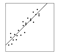
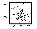
It helps a lot to graph your data in scatterplots. In a scatterplot, you put one variable along the X axis and the other up the Y axis. Then, for each record, you look up its X value and its Y value and you put a dot above its X value and to the right of its Y value. Imagine a vertical line coming up from its X value and a horizontal line coming across from its Y value: The dot goes where the two imaginary lines cross. This could get pretty tedious.
Open Office Calc can make scatterplots for you. Click on the garish little bar chart thing in the toolbar along the top of the spreadsheet or else activate the "Insert" menu and pick "Chart." Select "XY Scatter" and accept the choice of scatterplots on the top (the default). Hit "Next." For "Data range," type in i2:j52 and click on "Series in Columns." Hit "Next."
Here you can put in a title for your graph, something like "Percentage of college graduates and percentage voting for Bush in 2004." For "Value (X) axis," type in "Percentage of a state's adult population with a bachelor's degree" or something like that. For "Value (Y) axis," put something like "percentage of the vote won by Bush." Hit "Next," and then pick "As Object in" and watch your graph come up somewhere in your spreadsheet. You can click in a white area of the graph so that little moving boxes come up along its edges and you can then drag the graph to someplace more convenient in your spreadsheet (as in not covering your Calc table).
Now, do the same thing for per capita income and Bush voting propensities. This time, for "Data range," type in k2:l52 and proceed as above.
Eyeballing your artwork, classify each of the two relationships as direct (trending from lower left to upper right) or inverse (trending from upper left to lower right). Do their trends conform to your expectations or did either of them surprise you?
Percentage of college-educated adults and percentage voting for Bush:


___________________________________________________________________________

Per capita income and percentage voting for Bush:


___________________________________________________________________________
Are they more cigar-shaped (very strong association), football-shaped (moderate relationship), or soccer-ball-shaped (no relationship)?
___________________________________________________________________________Calculating Correlation Co-efficients
Now you can figure out your correlation co-efficients. To do this, you can use OpenOffice's statistical function to do this. Here's a matrix in which to put your results and the Calc formulae below:
------------------------------------------------------------------
H         X               Y          r            t         prob

1.   %>24:BA        %kbo Bush     ________    ________    ________

2.   per cap inc    %kbo Bush     ________    ________    ________

------------------------------------------------------------------

     Calc formulae for the cells in which you're going to put your results
     (let's just pick k70 for Hypothesis 1 and k71 for H.2, and you might
     want to label them in i70 and i71)

          in cell K70 -- rH.1  =correl(I2:I52;J2:J52) for H.1
          in cell K71 -- rH.2  =correl(K2:K52;L2:L52) for H.2

     Then do t-tests of the correlation co-efficients (r) (the 51-2 bit is
          because you have 51 "states" minus one degree of freedom for each
          variable involved) and put them in cells K73 and K76:

          in cell K73 -- tH.1  =(K70*(sqrt(51-2)))/sqrt(1-K70^2)
             K70 is used here to mean whichever cell you put r for the first
             hypothesis in, and you may well have designed your spreadsheet to
             put it in some other cell
          in cell K76 -- tH.2  =(K71*(sqrt(51-2)))/sqrt(1-K71^2)

     Again, punctuation is critical and you can block copy to save typing.

     And, now, because spreadsheets are a little touchy, in their construc-
          tion, and can't handle negative numbers in a bit, we need to get
          the absolute values for these two tcalc values. So, in cells, K74 and
          K77, respectively, calculate the absolute t-values (get rid of the
          negative sign):

          in cell K74 -- abs tH.1  =abs(K73)

          in cell K77 -- abs tH.2  =abs(K76)
Now, figure out the significance of these relationships by figuring out the
probability that the calculated t could have been exceeded by sheer sampling
error. Because correlation does not address causality, we'll use a two-tailed
test to evaluate the significance of the correlation co-efficients.
Now, use the two-tailed row on the t table at https://home.csulb.edu/~rodrigue/geog200/tandZtable.pdf), to determine the critical value for t at the pre-selected alpha and the appropriate degrees of freedom (51-2) (use the nearest df).
tcrit = ______________________
Compare this tcrit value to the tcalc values you calculated for your two hypotheses. Are the tcalc values larger than the tcrit values?
For H.1 _____ yes _____ no
For H.2 _____ yes _____ no
Can you reject your null hypotheses at your chosen alpha level?
For H.1 _____ yes _____ no
For H.2 _____ yes _____ no
Now, let's figure out the prob-value associated with your calculated t values. I will spare you the drudgery of figuring it out of Table C of M & M. You can do this in OO Calc, if you have absolute tcalc values, which you do (above). For some reason, spreadhseets throw hissy fits if you use the original negative values.
     Calc formulae for figuring out actual prob-values:

          in cell K79 -- prob H.1  =TDIST(K74;49;2) for H.1
          in cell K80 -- prob H.2  =TDIST(K77;49;2) for H.2

     Now, that's pretty cool, even if you have to deal with Calc's problem
          with negative t scores!  No more rummaging around in Table C!!!
So, using these two answers, how would you describe the probability that
random sampling could have given you results this extreme?
For education and voting Bush? (H.1)    _______________________

For income level and voting Bush? (H.2) _______________________
Given these results, which, if any, of the two associations is significant at the chosen alpha level? That is, which (if any) of the tcalc is larger than the tcrit taken from the table? Or, alternatively worded, which (if any) of the prob values is less than your chosen alpha level?
___________________________________________________________________________Any prob-value smaller than your chosen level should be considered the mark of a significant relationship, one too extreme to be regarded as a chance artifact.
Interpretation
In light of these findings, please state in English what you've learned about these two potential associations.
___________________________________________________________________________

___________________________________________________________________________

___________________________________________________________________________
LAB EXERCISE B: Simple Linear Regression Analysis
Regression is closely related to correlation, but it gives you more information. Correlation strictly measures the degree of association between two variables, with no causation implied. Regression allows you to specify a direction of causality or influence and then create a mathematical model describing that influence. This models the degree of influence that one independent variable, X, has over another dependent variable, Y. That is, it measures the degree to which variation in X drives variation in Y. You can come up with such statements as "Variable 1 explains 47 percent of the variation in Variable 2."
This means that you have to set up hypotheses expressing your sense of the direction of causality. These hunches are grounded in theory or in plain common sense where theory is not yet well-developed.
So, go back and look at your arguments about what you think affects predilection for voting Republican. For the per capita income and Bush vote variables, which is the X and which the Y?
_____ per cap inc _____ %kbo Bush
_____ %>24:BA _____ %kbo Bush
Your regression models will be taking the form of Y = a + bX, where Y is the expected value of Y for a particular given value of X. The a stands for the Y intercept, or the point on the Y axis where the regression line crosses, while b stands for the slope of the line. The model will explain the variation in Y resulting from the influence of X, which gives us the co-efficient of determination or r-squared (you just square the correlation co-efficient you calculated earlier).
Here's a table summarizing the important expressions in a regression model:
------------------------------------------------------------------

                    r     r sq.     b      a       t     prob   *?

  %>24:BA-->Bush  _____   _____   _____   _____   ____   ____  ___

percapinc-->Bush  _____   _____   _____   _____   ____   ____  ___


------------------------------------------------------------------
First, bring down the r, the t, and the prob-value you calculated earlier in
the correlation and mark each significant prob (at whichever alpha you decided on) with an asterisk next to it. Second,
square each of the r's to get the co-efficient of determination. Third,
calculate b and a in OO Calc by using these formulae. It is very important
that the first array within the parentheses be the Y variable, followed
by a comma
and then the X variable. Punctuation is really important here, folks.
       %>24:BA predicting %kbo Bush

               b    =slope(j2:j52,i2:i52)

               a    =intercept(j2:j52,i2:i52)


       per cap inc predicting %kbo Bush

               b    =slope(l2:l52,k2:k52)

               a    =intercept(l2:l52,k2:k52)
Now, for each hypothesis, draw the regression line (ideally right on your
scattergram). To do this, put a mark on the Y axis at the value for a. To
draw a straight line, you will need a second point. The easiest thing to do
is to put a faint mark above the mean X value at the height of the mean Y
value.
Then, just draw a straight line from a through mean X @ mean Y and extend it
to the right edge of your graph. Voilà! your regression line!
The regression line minimizes the average square of the vertical distance
between itself and each and alllllllll of those dots. This gives you a
succinct mathematical description of the trend in those data points.
Another way to do it is to click on one of the dots inside your graph in Open Office, right-click, and then pick "Add Trendline" and then picking "Linear." Calc can fit the regression line for you. That is pretty slick, isn't it?
What Does It All Mean?
In plain English, state what your regression models tell you about the influence of education on voting and of income on voting. For a hint about how to phrase this, visit the beginning of Lab B.
___________________________________________________________________________

___________________________________________________________________________

___________________________________________________________________________

___________________________________________________________________________

___________________________________________________________________________
Reflecting on the Election
Review your tables, graphs, and interpretations at the end of each section of this lab. Did your results conform with your expectations at the beginning of the lab, or did you get surprising results? Meditate on all these issues and jot down your interpretation of results below. Bring the completed lab to class on the due date, ready to discuss what happened in this election. You will find the results even stranger than you think! I found them quite amusing on the surface of things, snarky political observer that I am, but a deeper understanding of the Modifiable Areal Unit Problem undermines some of the pleasure, as you will see on the 10th.___________________________________________________________________________ ___________________________________________________________________________ ___________________________________________________________________________ ___________________________________________________________________________ ___________________________________________________________________________ ___________________________________________________________________________ ___________________________________________________________________________ ___________________________________________________________________________ ___________________________________________________________________________
first placed on the web: 11/26/98
last revised: 04/14/14
© Dr. Christine M.
Rodrigue