California State University, Long Beach
Geography 458/558: Hazards and Risk Assessment
Isoseismal Mapping

Introduction
There are two different approaches to measuring an earthquake's severity: magnitude and intensity. Magnitude measures (there are several, including the famous Richter scale) express the energy released in an earthquake; intensity measures (i.e., the Modified Mercalli Intensity scale) express an earthquake's severity in terms of more subjective overall impacts on human beings, their assets, and the physical environment. This lab will introduce you to the mapping of an earthquake's intensity, using isolines.
Isolines are a type of symbol used in mapping. Isolines are any line on a map connecting places having the same value of "something or other." Here are some other examples of isolines (sometimes called isarithms or isopleths):
In this lab, you'll construct your own isoline map, one based on the Modified Mericalli Intensity Scale. The isoline involved is called an "isoseism" and the map you'll make is called an "isoseismal map."
- parallels and meridians connect places having the same latitude and longitude values, respectively
- contour lines connect places having the same elevation
- isotherms connect places reporting the same temperature
- isohyets connect places having the same precipitation levels
- isobars connect places having the same barometric pressure (air pressure) values corrected for elevation
An isoseism encloses all places having the same level of intensity of shaking and damage, as reported by people who fill in a survey for the USGS or other earth science agency about their experiences. If you ever feel an earthquake (or learn about one nearby that you didn't feel), you can help the USGS collect intensity data on it by visiting the Did You Feel It? website and filling in the form about your experiences and giving your location at the time of the event, so they can map your intensity report. The USGS then collates reports from everyone calling in and assigns intensity values to their locations. Most reports in an area will pretty much agree with one another (you'll see a bunch of 4s next to one another).
Some readings don't fit the pattern, though: You might have a 6 or a 2 sitting all by itself in a region dominated by 4s. This could be because there's something unusual about the soil there that amplifies shaking (such as unconsolidated deep alluvial soil) or dampens shaking (an area of well-consolidated bedrock). Alternatively, it could be because the individual calling in an anomalously high reading is the kind of person who exaggerates things. An anomalously low reading might be from someone who isn't very observant or who can sleep through anything but felt they should call in anyway.
Download Your Data
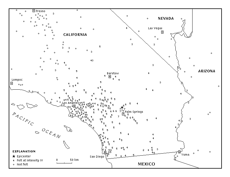
For this lab, what you'll do is print out a copy of a map showing earthquake intensity reports in the wake of the magnitude 5.6 earthquake in North Palm Springs back on the 8th of July of 1986. Click on this link to view and print this map, which was put out by the Southern California Earthquake Center. As soon as you've printed it, please put your name and class number on it.
Now, examine the pattern of earthquake intensity reports by location.
- Take a close look at where the highest values (7s) are felt. This is the epicentral area, sort of the target bull's-eye of your map.
- Notice how the numbers get lower and lower as your eye moves away from the epicentral area.
- Observe how the numbers don't decline at an even rate in all directions from the epicenter: You see fairly high numbers extending out kind of far in some directions and some smaller numbers reaching in rather close in other directions. The pattern is wavy because of the differences in underlying ground conditions: mountains (fast, low amplitude earthquake waves) or valleys (slow, high amplitude shaking).
Once you have a sense of the spatial pattern of reported earthquake intensities, start pencilling in isoseisms by enclosing all areas reporting a 7, a 6, a 5, a 4, a 3, and not felt (a o). If you were doing the 5-4 isoseism, for example, you would want to draw it so the 5s were inside your isoseism and the 4s were outside. All you need to do this lab, beside an Internet connection, is a pencil and, if you're ambitious, colored pencils.
Pencil in Your Isoseisms
Now, have a look at the patterns of intensity reports (it might help to review the Modified Mercalli Intensity scale by clicking here). Start lightly penciling in isoseismic zones by enclosing all the areas around the epicenter (the star) with reports of 7. Then, try separating areas dominated by the 6s from those dominated by the 5s. You will start to notice odd readings in here: anomalous readings within a zone, such as some 4s and 6s well within an area dominated by 5s. You are trying for pretty smooth isoseismic lines, so don't feel obligated to zig your lines absurdly to cover one of these anomalies. You are mapping the general trend, not trying to gerrymander!
When you think about it in light of the introduction to this lab, it makes sense that you'll have anomalous readings. The people calling in to report their experiences might have been in terrain where the seismic waves travel fast with lower amplitudes and, so, do less damage. This is a subjective scale, which depends on people honestly and thoroughly reporting the kinds of things this scale is based on. Also, your experience of an earthquake depends (at lower intensities) on whether you are moving around or lying/sitting still or whether you're on the upper floors of a building or on the ground floor.
Anomalous readings also have a lot to do with the kind of rock and soil underneath the people calling in. Seismic waves speed up and their amplitude diminishes in solid rock that is well-consolidated, so a caller might be fairly close in to the epicenter and not have so dramatic a story to tell. Seismic waves slow down, forcing their amplitude to increase, in loose, unconsolidated soil or rock materials, such as the marine and alluvial fill on valley floors. Someone calling in from such a location may be relatively far from the epicenter and yet still experience a great deal of shaking and damage. Also, some people are kind of sensitive and tend to dramatize things; others are stoic and may understate what's going on around them.
So, keeping all that in mind, you want to draw smooth isoseisms that express the general trend, not every anomalous reading. In other words, you want to draw in smooth curves, such that nearly all of the 6s are inside the line, and most of the 5s are outside the line. You are basically delineating general regions that experienced different levels of intensity.
Completing the Map
Look over your map carefully at this point. Your isoseisms should form sort of a bull's-eye pattern (pretty wavy bull's-eye, to be sure), with the circle in the middle enclosing the area dominated by 7s and each band beyond that enclosing areas with progressively smaller and smaller intensity levels. None of your isoseisms should touch one another or cross one another. Make sure you see the bull's-eye pattern and make sure there are no crossing or touching isoseisms.
When you're happy with your penciled-in isoseisms, go back over them, neatly, in darker pencil or ink (committing yourself). Now, label each of the zones, but don't use the Arabic numbers: Use Roman numerals. Roman numerals are used to make sure people don't confuse an intensity reading with a magnitude reading, which uses Arabic numerals. So, 7=VII, 6=VI, 5=V, 4=IV, and 3=III.
Ideally, you might want to color the bands in, with a consistent color scheme that ramps up from light to dark OR vice-versa OR white to some dark color OR maybe from some cool color to a hot color. This ensure that your reader's eye is immediately drawn to the middle of the map where the intensity is highest. Ramping is an important part of map communication, so think about how you want the colors or the pattern to ramp up to the highest values, such as white, light grey, medium grey, dark grey, black or maybe black, purple, blue, green, orange, yellow or maybe purple, blue, green, yellow, orange, red.
Here are some good color ramps:
Here are a couple of lousy color ramps. See if you can figure out what makes them bad choices.
not felt very low moderately low medium moderately high very high
---- not felt ---- III IV V VI VII
-3 -2 -1 +1 +2 +3
not felt very low moderately low medium moderately high very high
-3 -2 -1 +1 +2 +3
Analysis of Your Isoseismic Map
Look closely at your isoseisms. You'll find that they certainly don't make perfect circles or ellipses: There are some concave and convex sections. Why might your isoseisms bulge away from the epicenter in some areas and toward it in others? Think about the hints given in the introduction to this lab. What happens to earthquake waves' speed and amplitude as they cross into different media? It might help if you looked at an image of regional topography, such as this one from NASA's MODIS Land Rapid Response Team.
- Look at the exact location of the epicenter compared to Zone VII (the star marked above Palm Springs). How would you characterize that location relative to your isoseism enclosing all the 7s? What is odd about its relative location?
It might help you answer the question above if you studied the diagram of epicenter and focus shown here:
![[ relationship of earthquake focus to epicenter ]](http://geomaps.wr.usgs.gov/parks/deform/eqepifoc297x164.gif)
- The fault that produced the North Palm Springs quake dips about 45° to the north and the focus was about 10 km down. Draw your own cross-section of the 45° fault dip and the ground surface, with a line linking the focus 10 km down with the epicenter on the surface right on top of it and North labeled in the direction the fault dips down. The problem with the block diagram above is that it's at an angle, which might distort the relative lengths of the triangle's sides. So, do your own drawing in 2-D.
- Given that information, about where would you expect the fault plane to intersect with the surface (north or south of the epicenter)?
- Looking closely at your cross-section, use your diagram to measure (or else use basic geometry or trigonometry to calculate) how far away the surface fault trace is from the epicenter.
- Referring to your diagram, explain why the epicenter is so eccentric with respect to the isoseism enclosing the VII zone.
- Why might the isoseisms form a wavy pattern, bending closer to the epicenter in some areas and away from it in others?
CSULB Department of Geography
Abridged and modified from a lab on earthquake measurement on the Southern California Earthquake Center web site
First placed on the web: 11/24/00
Last revised: 11/02/17
© Dr. Christine M. Rodrigue