California State University, Long Beach
Geography 558: Hazards and Risk Assessment
Earthquake Epicenter Triangulation

Introduction
This laboratory exercise will familiarize you with the general idea of locating earthquake epicenters. To do the lab, you will need a card (like a 3" by 5" or a 4" by 6" notecard), a compass for drawing circles (you can fake it with the eyeball method without a compass if you're careful), and a pencil or pen. A ruler and a calculator may be helpful.
The method is based on the fact that there are different types of seismic waves and that each type moves at different velocities than the others. The fastest waves are body waves that move through the body of the earth from the focus. These are of two subtypes: The faster of these is the primary wave, or compressional wave, often called simply the P wave. Primary waves first compress and then dilate the materials through which they pass (kind of like the coils of a "Slinky" toy).
The primary wave is followed in time by the slower secondary wave, or shear wave, or S wave. Secondary waves cause materials to move at right angles to the direction the wave is moving (kind of like the snaking motion in a rope if you were to pick it up, shake it, and then watch the wave move along the rope).
Even slower are the various surface waves, or waves that move along the earth's surface or along discontinuities in the crust, instead of moving through the body of the earth. An example is the Love wave, in which materials move at right angles to the wave itself, but can only move horizontally or parallel to the surface. Another surface wave is the Rayleigh wave, in which rock molecules move in circular paths, rotating backward against the motion of the Rayleigh wave (very much like water molecules move as a wave passes through them in the open ocean, except for the reverse rotational movement of the molecules involved).
Now each wave can travel somewhat faster through dense, uniform, and rigid materials (such as basalt or granite) and somewhat slower (with greater amplitude) in less dense, less uniform, and less consolidated material (such as the river deposits, or alluvium, forming the floor of a valley). Even so, the different wave types are affected similarly by the materials they cross. As a result, there are relatively constant ratios between the velocities of different pairs of seismic wave types, no matter what kind of material they're passing through.
Given this constancy of ratio, then, we can use the difference between the arrival times of different pairs of wave types at a seismic recording station to figure out the distance from the focus to the station. By triangulating among at least three such stations, it is possible to define the probable epicentral area, at least generally.
In more detail, P waves generally travel between 5.95 and 6.75 kilometers per second in the crust, depending on compressibility, rigidity, uniformity, and density of the materials traversed. S waves tend to move at velocities between 2.9 and 4.0 km/sec in the crust. Love waves are emitted in a range of periods or frequencies and their velocities vary with period, most in the 2-6 km/sec range. Rayleigh waves travel somewhere between 2.7 and 3.7 km/sec, making them usually a little slower than the Love waves. Both surface wave types travel somewhere around 90% of the velocity of the S waves. Expressed as ratios, these are:
- Vp:Vs = 1:1.73 or Vs:Vp = 1:0.58
- Vs:Vr or l = 1:1.09 or Vr or l:Vs = 1:0.92
Directions for Estimating a Station's Distance from the Epicenter
Time and distance can be graphed for each of the wave types (Figure 1). What you need are the arrival times for any two pairs (P and S, S and R, or P and R) of seismic waves. You subtract the arrival time of the faster wave from that of the slower wave to get the difference in arrival times.
Then, take a card and align it on the Y or vertical axis of the graph, which shows difference in time. Put marks on the card to show the difference in time between your two waves.
Now, move the marked card into the body of the graph, sliding it right and left. Keep doing this until the two tick marks on your card are perfectly lined up with the two curves matching the two wave types involved. Make sure your card is exactly perpendicular with the X or horizontal axis (distance), so the card is straight up and down where it crosses the two curves. Now, read down to see the distance on the X axis. This is the approximate distance between the earthquake's focus and your seismometer. Give your answer rounded to the nearest 250 km.
An example of the process is shown in Figure 2. Here "your" card is shown in blue, its edges marked with the same scale from the Y axis. In the example, let's say that the difference in time between the P wave and the R wave was 9 minutes. The card has been positioned so that there are 9 tick marks in the gap between the P wave's curve and the R wave's curve (and the lower edge is parallel with the X axis). Now, reading straight down from the marked edge, you see that the seismic station was about 3,000 km from the focus. So, that's how you get the distance for your map and you can now draw a circle with a radius corresponding to 3,000 km around the seismic station in question.
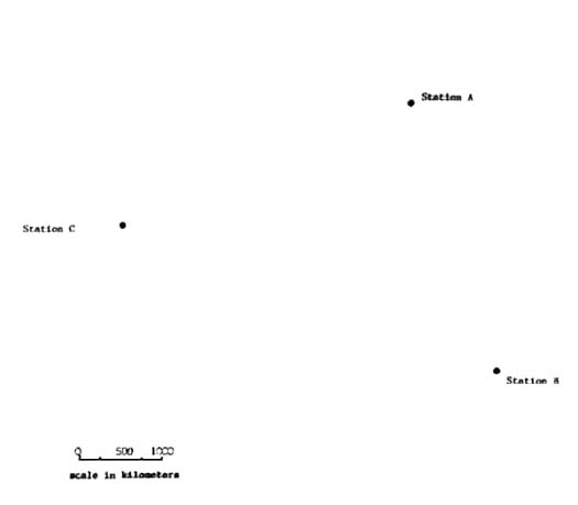
Mapping Distances to Epicenter
To use these distances to create a map of the probable epicenter on Figure 3, you can use a ruler or the edge of a card and a compass. For each of the three stations, convert the distance from the station to the epicenter into the units of measure provided as a bar scale on the map (marked 0-1,000 km). Then, stretch your compass just that distance. Now, center the metal point of the compass on the station and use the pencil on the other arm of the compass to draw a circle centered on each station. This circle represents the station's distance from the epicenter. When you've done all three, you will notice that the three circles come together in one area: That is the probable epicenter (the point on the earth's surface lying directly above the earthquake's focus). Ideally, the three circles would cross at one point, kind of like an asterisk. That generally doesn't happen, however, because the focus may be at some depth from the epicenter above it. This method is actually triangulating on the focus, when what you're interested in here is the epicenter above the focus, so there will be some minor departure from a perfect asterisk-like crossing of the three radii.
In the real world, readings from all stations around the world recording the seismic event will be used to estimate the epicenter and the magnitude of the event. More local stations will help locate the focus.
That is why reports on the epicenter and the magnitude will shift around in the hours and weeks after a major quake, reflecting the integration of data from more and more sources. For example, the January 17, 1994, earthquake in L.A. was first reported as a 6.6, then a 6.8 (as some really high and anomalous readings came in from Scandinavia), and finally a 6.7. The epicenter at first was reported as in San Fernando and then a few hours later "somewhere near Northridge" and was eventually (about a week later) pinpointed in Reseda (but the media by then had dubbed it the "Northridge" earthquake).
We saw a tragic replay of that initial magnitude and epicenter uncertainty in the Sumatra or Boxing Day earthquake, which generated the great tsunami that killed over 225,000 people (and maybe as many as 310,000) on December 26, 2004. A Hawai'ian seismic lab first noticed the data indicating that an earthquake had happened near Sumatra and their first estimates were that the quake had a magnitude about 8.0, which they felt was not likely to raise a tsunami. As data from more stations were coördinated, it became obvious some time later that the quake was much bigger, perhaps an 8.6, which caused some geologists in Colorado to activate software that would notify the White House, the State Department, and international relief agencies. Meanwhile, the Hawai'ian seismologists, watching the data coming in from more and more stations, realized it was a 9.0, one of the greatest quakes of the century, and that such a quake surely would raise a tsunami. There was no warning system in the Indian Ocean nations, and they knew that the tsunami must have already killed thousands of people near the epicenter, so they improvised and began calling U.S. consulates in nations they calculated hadn't yet been hit (e.g., Somalia and Kenya in East Africa) and the consulates did get the word out in time to trigger a massive evacuation in Kenya, where only one person died, and even in Somalia, which has virtually no central authority or media due to civil conflict there, and even so enough people there got the word out to save thousands of lives.
Epicenter Triangulation Problems
Station A records the first arrival of P waves at 14:05 UTC (Universal Time Coördinated, or Greenwich Mean Time). The S waves arrive at 14:09.
- What is the difference in time between their arrival? ______________
- About how far away was the earthquake, in kilometers? ______________
- Draw a circle on the map around Station A with that radius.
Station B records the S waves at 14:10 UTC and the R waves at 14:16:30.
- What is the difference in time between their arrival? ______________
- About how far away was the focus, in kilometers? ______________
- Draw a circle on the map around Station B with that radius.
Station C records the P waves at 14:01 and the R waves at 14:03:30.
- What is the difference in time between their arrival? ______________
- About how far was the focus, in kilometers? ______________
- Draw a circle on the map around Station C with that radius.
Now, label the area where the three circles come together as "probable epicenter."
Adjustment for Online GEOG 558
For those of you in the all-online GEOG 558 for EMER, we're going to have to get a little "creative" for you to hand this in. You have a couple of options here. You could scan your freehand artwork and put it in the Dropbox as a pdf, jpg, gif, or png file or, alternatively, you could paste a jpg, gif, or png image file into a word processed document where you've put the answers for the questions above. Or you could try this, instead, if you're using a PC computer (Windows).
Click on https://home.csulb.edu/~rodrigue/geog458558/epicentermap.jpg. Save it on your computer or flash drive somewhere you can find it. Then, open the Paint program (on Windows, at least the XP and 7 versions, you can get to it from Start -- All Programs -- Accessories -- Paint). In Paint, open the epicentermap.jpg.
Now, click on the grey ellipse on the far left tool collection. That will allow you to draw a circle or ellipse on the map roughly where the three circles on your paper map overlapped to indicate the probable epicentral region. It can be a little tricky getting the circle the right size, shape, and location: You may be doing a few Control-Z episodes to erase it and start over. If it's almost perfect, but you want to move its location, you can touch the square select box at the top of the tool collection and then define a square around the circle. You will now be able to move the circle right where you want it. If the circle is in the right area, I'll know you did the rest of it right. Once you're happy with it, save it as EpicenterYourLastName.jpg.
However you do your artwork, upload either the scanned image or your Paint image to the course's Dropbox, together with your answers to questions 1 and 2 under each station. This can be done as two separate files (map plus answers) or you can paste the image into your answers document to create one file.
Figures
Figure 1 -- Average Times that Primary, Secondary, and Rayleigh Waves Take to Cover Given Distances (very idealized)
![[ graph of seismic wave travel time as a function of distance ]](https://cla.csulb.edu/departments/geography/jpegs/wavestimedist.jpg)
Figure 2 -- How to use card (blue) marked with ticks from the Y axis to separate two wave types and infer distance (here, 9 minutes time difference between the P wave's arrival and the R wave's arrival, resulting in a spatial separation of 3,000 km)
![[ graph of seismic wave travel time as a function of distance ]](https://home.csulb.edu/~rodrigue/geog558/labs/epicenterchartuse.jpg)
Figure 3 -- Map of Seismic Stations A, B, and C, showing the scale to use
![[ map of three seismic stations ]](https://cla.csulb.edu/departments/geography/jpegs/epicentermap.jpg)
CSULB Department of Geography
First placed on web: 11/26/98
Last revision: 06/13/16
© Dr. Christine M. Rodrigue