CALIFORNIA STATE UNIVERSTIY, LONG BEACH
GEOG 400/500
Geographical Analysis
The Factor Analytic Family
Principal Component Analysis

Introduction

The purpose of this lab is to introduce you to the factor analytic/principal component analysis family of techniques. FA/PCA allow you to pick out the structure of a multivariate database without deciding which are independent and dependent variables, the way you do in regression. So, these techniques are used for data-reduction and to test models of the purported internal structure of data. Probably the most commonly used method in this family is principal components analysis (PCA), which represents an inductive approach to data-reduction. This lab will give you experience in running a PCA on "areochemical" data.
These days it is common to deal with humongous databases with vast numbers of records and all kinds of variables collected for each record. There may be quite a bit of redundancy and multicollinearity among them and it might be overwhelming to try correlation and regression analyses among so many variables (and you need to know enough about the data to pick X and Y variables to begin with).
PCA/FA allow you to reduce the original pile of data from a large number of original variables to a much smaller, more manageable number of underlying factors, which, in a way, can be thought of as artificial or "fake" variables. The idea here is to come up with "components" or "factors" that represent a lot of the variability in the database, because each "fake variable" is highly correlated with several of the original variables.
Goals of this lab, then:
- have you do a PCA in SPSS
- familiarize you with "visualizing" or at least imagining a scatter of data ("data cloud") through a p-dimensional hyperspace and discerning ways of simplifying its structure, maybe even down to the 2 to (arguably) 4 dimensions we can visualize
- give you even more practice using SPSS
- have you try building PCA models using both unrotated axes and orthogonal rotations of axes in your p-dimensional hyperspace (it'll make sense one day actually)
- give you practice in using statistics for physical geography, geology, geochemistry, and similar applications
- introduce you to geomorphic zonation by inference from track data
Project deliverables are:
- lab answer sheet, printed, filled out, and, oh, yeah, autographed
- SPSS "rotated component matrix," autographed
- Calc graphs for PCA-determined groupings of original chemicals, autographed (you'll need four to handle fifteen chemicals)
- Calc graph of the three principal components that emerged out of your analysis, as they vary across time (the Spirit rover's trip across Gusev Crater's floor from "Sol 14" through "Sol 470"), autographed
Background Information
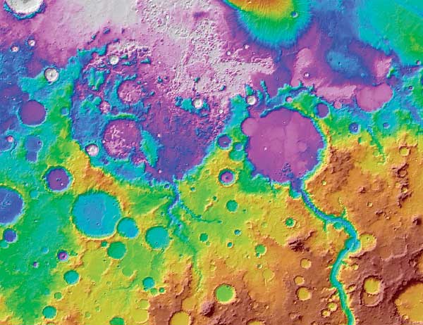
This lab project deals with data taken by Spirit, one of the two Mars Exploration Rovers. Opportunity is travelling around in Meridiani Planum, while Spirit is located antipodally, over at Gusev Crater. The data come from an article published in the Journal of Geophysical Research (Planets) by R. Gellert et al. in 2006. To get your areographical bearings, here is a map locating the two rovers:
![[ MOLA map of Mars, showing locations of the Spirit and Opportunity
rovers ]](http://www.csulb.edu/~rodrigue/geog400/MOLASpiritOpportunity.jpg)
Your data consist of 93 records of chemical abundances derived from spectra taken by the Alpha Particle X-Ray Spectrometer (APXS) on the Spirit Mars Exploration Rover at Gusev Crater (roughly 170° E by 15° S). APXS shoots a stream of alpha particles (basically, helium nuclei), which are a form of highly ionizing particle radiation. These particles smack into substances in front of the APXS. Some of these are reflected directly back into the spectrometer by the heavier atomic nuclei they hit. These are unaltered in wavelength or electron volts because they were not absorbed. In other cases, the alpha particles knock electrons out of the inner electron shells of an atom. This then allows electrons from outer shells to pop down to fill the suddenly abandoned lower orbital places (highly "desirable" electron real-estate). To drop inward, however, the electrons have to dump some of the energy they needed to hang out at higher orbitals, which they do by releasing X-ray photons to "pay" for the real-estate upgrade. The APXS then registers the distribution of these X-ray photons, generating spectra (line graphs of energy levels measured in electron volts by intensity measured in counts per second of reflected alpha particles or X-ray photons). Electron volts or eV are units of energy suited to measure extremely tiny changes in energy state (vastly smaller than the joules or watt hours more commonly used). These spectra have peaks and pits arranged in shapes typical of particular substances and they can be compared with spectral libraries. Here is an example:
![[ spectra for two rocks from Spirit APXS at Gusev ]](http://web.csulb.edu/~rodrigue/geog400/graphics/APXSspectra_180804s.gif)
These can be processed to identify particular chemicals and the percentages they comprise in the rock surface. Our database expresses most of these (all the oxides) as percentages, though a few of the rarer items (elements) are shown as parts per million. Since we are relating the extent to which variation in one is associated with variation in the others, the orders of magnitude difference in scale is not a problem, though it will make for some æsthetic headaches in graphing them. You, too, will develop an "artistic temperament"!
Getting the Data
The data are, again, available as an Calc spreadsheet: gusev.ods. As usual, click to download the file to your flash drive or wherever. Open it up in LibreOffice or OpenOffice and admire it. Now, save it as an Excel spreadsheet, gusev.xls (you're probably safer using the 3 letter extension [Excel 97/2000/XP], not the .xlsx version in the Save As drop-down menu). This is the version that SPSS can open, and you can keep the original gusev.ods just in case you mess up somewhere along the way. At this point, CLOSE the .xls spreadsheet. Fire up SPSS.
Now, "Open an existing data source." Browse to the drive you saved gusev.xls in. Once you're in the right drive, pick .xls for the type, which should bring up all the xls files you have on your drive. Double-click on gusev.xls.
On the dialogue box that comes up, make sure that "Read variable names from the first row of data" is checked. Leave "Worksheet" alone. Hit "Okay," and your spreadsheet should come up on the SPSS data editor box. Immediately save the file as in SPSS native format: "gusev.sav."
Once it's been safely opened in SPSS and saved as gusev.sav, you can open the original file in Calc without upsetting SPSS, in order to do a little bit of preliminary analysis before we get to the actual PCA. More on that in a bit.
First, a little about the data. The column (variable) headers are chemicals expressed in chemical notation (e.g., H2O or CO2). The record names are the rather whimsical names of particular rocks from which Spirit either took a spectrometer reading, cleaned off the rock and took a spectrum, or used its "RAT" (Rock Abrasion Tool) to cut into the rock and then take a spectrum. Each of these events took place on a particular "sol" or Martian day, so I am designating each event by sol (I put this into Column A), rather than rock name, for graphing later. The sol, by the way, is a skosh longer than the Earth day, at 24 hours 39 minutes and 35 seconds. The Martian year consists of 687 of our days or 669 sols.
The larger the sol, the farther Spirit had travelled by then, so time loosely implies space, though Spirit travels at wildly different rates of speed. You should be able to pick out the signal of the terrain Spirit is crossing with PCA. As such, you will be using PCA to carry out a task that physical geographers and geologists call "zonation," using a transect of some sort to identify places where things change, boundaries between different regions that the transect crosses. Remote sensing folks could use such zonation to identify a sample of points in each zone to use as "training points" for remote sensing software to perform unsupervised classification of an image of the area to create geological maps from the images.
Here are a few resources and geotidbits that might be helpful to you later:
- You can get to a panorama view of Spirit's travels here: http://marsrovers.jpl.nasa.gov/mission/tm-spirit/images/sol_572_in_sol149Pan.jpg.
- Here is also a helpful link to a large scale geological map (so large scale that it cuts off the earliest part of Spirit's trip): http://photojournal.jpl.nasa.gov/catalog/PIA07155.
- A smaller-scale geological map can be had here: http://www.psrd.hawaii.edu/WebImg/GusevGeol.gif, with Spirit south of the letter "c," just west of the finger of material on the north end of "e."
- Here is an even smaller scale topographical map showing Gusev Crater and the distinctive Ma'adim Vallis seemingly pouring into its south-southeast border (which was why Spirit was sent there in the first place, to look for the signs of an old lake formed by that seeming river) http://www.esri.com/news/arcuser/0404/graphics/mapmars_1_lg.jpg
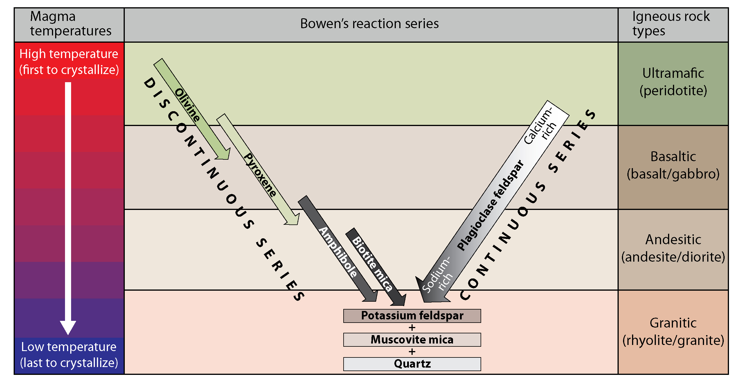
- It would be helpful to dust off what you know of Earth's planetary structure from way back in GEOG 140 or GEOL 102: the division into iron-nickel dominated core, mafic and ultramafic silicate rock dominated mantle, mafic silicate dominated oceanic crust, and felsic silicate dominated continental crust. This is a legacy of the planets assembling from the aggregation of solids (dust, gravel, and larger chunks) available in the proto-planetary disk around the young sun, which had to do with temperatures at various distances from the sun. Planetary structure then developed out of their once-molten past, with gravitational layering by density and fractionation of minerals out of primordial magma. There were subsequent melting events in particular sequences driven by temperature and pressure conditions. When magma solidifies as it cools, there are two orderly changes in minerals solidifying. One is governed simply by the changes in temperature (the non-reactive branch) and the other by temperature and interactions between certain solidifying minerals and the "rock soup" around them (the reactive branch). Click to see a graph of this "Bowen reaction series." Elemental nickel on the surface of a planet often means meteorite-derived material (though sometimes it can represent dissolution of nickel from ultramafic rock into groundwater and then concentration elsewhere when the water evaporates).
- It might also be helpful to remember that minerals can be altered into other minerals through interaction with water (something the MER team is really trying to identify), carbonic and sulfuric acids in water, and dissociated ions formed from water (OH-, H+, and H3- ). Minerals that solidify early in the hottest magmas (e.g., olivine, peridotite, calcium plagioclases, pyroxenes, ambiboles) are particularly vulnerable to alteration, which is one reason why they're pretty scarce on the earth's surface and why the more resistant quartzes and feldspars are so common on the earth's surface (and beach sand).
- Even really basaltic magmas can produce andesites (more felsic rocks) if they come up into or under water, ice, or permafrost. Mars has had less tumultuous a history, so its crust is still loaded with these mafic and ultramafic minerals and associated chemicals. So, what Team Spirit is trying to do is pick out trends toward water-altered Earth-like conditions rather than "end-member" cases.
- One last tidbit, the halogens are a group of elements of varying atomic numbers but which all have seven electrons in their outer shell and they are extremely reactive, "trying" to cop one more electron to create a stable outer shell. Two of them turn up in your data here: chlorine and bromine. They are interesting because their proportions increase linearly with the processes of evaporation in water and resulting precipitation and concentration of various salts.
A Few Preliminaries about Data Conformity
to Principal Components Analysis Standards
Before we get going, we should check if the data fully conform to ideal rules-of-thumb mentioned in Grimm and Yarnold having to do with the appropriateness of using PCA. There ARE two slight shortcomings in this data set, but, since this is a pædagogical exercise, we'll just blunder on.
In the real world, you would be able to use this technique on these data, but you would be expected to comment on the shortcomings and alert the reader to them as possibly detracting from the analysis (note to future thesis authors -- faculty look for expressions of that kind of critical self-awareness). Check off the "problem children" here:
- _____ Level of measurement. Are the variables (chemical abundances)
scalar or interval in measurement level (as opposed to nominal or ordinal)?
- _____ Absolute minimum number of variables. What is the absolute minimum
_____? and how many do we have _____?
- _____ The subjects-to-variables (STV) ratio or the records-to-variables
ratio. What is the STV ratio here?
_____
- _____ Minimum number of observations. What is the ideal minimum? _____
and how many do we have? _____
- _____ Normalcy. For each chemical, use Calc to calculate the mean and median abundances and the standard deviation. Mean =average(c2:c94). Median =median(c2:c94). Standard deviation for samples =stdev(c2:c94). Now, calculate skew, using the Pearson's skew measure =3*(c96-c97)/c98, assuming you put mean in row 96, median in row 97, and standard deviation in row 98. Copy all formulas across for all chemicals. Now, eyeball those skews. Do any have an absolute value bigger than, oh, 1.00? How many? _____ If there is(are) any skewed variables, put a check beside normalcy and remember that you should comment on it (and, if you were ambitious, do the analysis both with and without the abnormal, but I'm not ambitious enough to grade all that!).
Data Reduction through PCA in SPSS
Now, click on the "Analyze" menu and choose "Dimension Reduction." On the data reduction menu, choose "Factor." Up comes a large box, the idea of which should be familiar to you from earlier work in SPSS. The directory on the left lists all variables in the data editor spreadsheet. On the right is a single box where you put all your variables except Sol and Sample for factor analytic processing (actually, Sample, being alphabetic and, thus, not interpretable in factor analysis, will probably not be shown on the left, and neither will Sol, which is partially alphabetic). Go on and highlight all your numeric variables and click the right arrow to move them over for analysis. You should have fifteen of them (count noses to be sure you haven't forgotten anyone).
Now, click the box labelled "Descriptives" (it's on the right of the dialogue box). Make sure "Initial Solution" is checked and put a check on "Coefficients" and "Significance Level" in the "Correlation Matrix" section. Click "Continue."
Click on the "Extraction" box now. It should read "Principal Components Analysis" on top and "Correlation Matrix" should show a check under the "Analyze" section. "Extract" should show the default checked: "Eigenvalues over 1." "Display" should already have a check mark by "Unrotated Factor Solution" at this point, and go on and put a check by "Scree Plot," too. Hit "Continue."
Click on the "Rotation" box. Any of the orthogonal rotations (quartimax, varimax, or equamax) will crisp the loadings and generate nearly identical collections of variables on components. Varimax works by pushing one or more variables in a component column toward zero, compensating by pushing other variables in the column closer to one. Quartimax focusses on rows, exaggerating high and low loadings across rows, making it easier to see on which component each variable is loading highly or little. Equamax tries to have it both ways. I think it might be easier to interpret this particular data set by quartimax rotation, so select "quartimax."
Open the "Score" box at this point. Put a click beside "Save as Variable" and then choose "Regression."
We'll accept everything else now, so click "Okay." Whatever you do, make sure to save your database as a .sav file (e.g., gusev.sav) and really be sure to save your output as an .spv file (e.g., gusev.spv). Stow those files where you can get to them later easily (e.g., your flash drive or e-mail them to yourself).
Wouldn't it be nice to be able to look at your database and output in some other program when you're far, far away from an SPSS-bearing lab? Click on your .spv file. Hit Control-A to highlight the whole schmear and Control-C to put it on Clipboard. Then, open up Writer or Word or whatever you use for word processing (or Calc, too) and hit Control-V to plop everything into a document you can open up and view to your heart's pleasure without being on a short SPSS leash. And be sure to save that document, too (e.g., gusevoutput.odt or .ods or .doc)!
You're not done yet. Click over to your .sav file (database). Scroll over to the far right side. At the end of the chemical columns, you'll see three brand-new columns, probably named something like FAC1, FAC2, and FAC3 (Factor 1, 2, 3). You want those! Save your .sav file to make sure you keep these three new columns.
Now, click on the grey box with these three new "variable" names to highlight those three columns. Hit Control-C. Open up your original Calc spreadsheet (gusev.ods) and put your cursor in cell 2 (not 1) of the column to the right of your last chemical (Br or Bromine). Hit Control-V and, voilà, you now have your three principal component scores for each of the 93 Martian sols! For each rock, you have its combined score for each of your three new fake variables. Make sure to put the component names in the top cells (e.g., PC1, PC2, and PC3). Make sure you didn't screw up their alignment: Scroll down to row 94 and make sure your three new columns end on row 94 in a nice straight line with all the other columns. If you're off one, hit Control-Z to undo the paste and reposition your cursor in cell two of column R and hit Control-V again and again make sure your last row aligns. And save that spreadsheet!
First Look at the Output
Now take a look at the output (.spv) file. I'll give you a "scenic tour" of the features, some of which will be important to you in an operational sense and some of which will be mainly just for your larger edification.
The first box is the correlation matrix, which gives you a handy table of which variable is related to which other and how significantly.
Next is a box entitled Communalities, which should have a column of 1's. The variation in each observed variable is assumed to be perfectly accounted for by the collection of all components, hence all the 1's. But what good is a 15 component model to explain 15 variables?
The second column, entitled, "Extraction," gives the communality of a variable, that is, the sum for all extracted factors of its squared loadings on them. Hunh? This is a measure of how much the variance in the observed variable is accounted for by the set of all factors or derived components that were extracted or kept in the reduced model. The communalities are now less than 1 but, hopefully, not so low as to be insignificant. These lower communalities are the small price we pay for getting a much more easily interpretable model with fewer factors (and dimensions) in it.
The third box is Total Variance Explained. Here we see the initial eigenvalues for all components (or underlying factors). If you added up the column entitled "Total," you would find that these eigenvalues sum up to the number of observed variables in your data set. The next column, "% of Variance," tells you how much of the variability in your data cloud is accounted for by each component, the first component packing the biggest wallop. The next column, "Cumulative %," tells you how much of the overall variability is accounted for the sum of components so far. In other words, how much total accounting you get as you add each component in.
A common rule-of-thumb in factor analytic techniques is to extract (or keep) only those underlying factors that have eigenvalues of at least 1. This is the default setting for SPSS, which we used. So, the last three columns repeat the information on total eigenvalue for each component, percentage of variance, and percentage of cumulative variance for just those components that are to be extracted under the extraction criterion (here, the default of > 1 eigenvalue).
How many components were extracted by SPSS using this default? __________
The next bit is the scree plot. You'll notice the concave-up shape of the curve as it drops from the upper left to the lower right. Check the nick point where the angle of that inverse curve bends sharply from a relatively steep curve to a relatively gentle slope.
How many components is that (the number of components to the left of the nick point)? __________
Is that the same number that SPSS extracted in the table just above it? __________ (it will almost certainly be either the same or off by one component)
Now, on to the pièce de résistance: the Component Matrix. We're going to be spending a lot of time on this.
Here, we see each of our original variables down the left axis and the extracted components across the top, designated by numbers in the order of their degree of accounting for the variability among the whole data set. The fun part is figuring out what the heck these underlying factors are and maybe even coming up with pithy names for them.
Have a close look at the eigenvalues for each variable loading on each factor. You should notice some sort of pattern here, where the first primary component boasts of the highest eigenvalues down the column but with varying performance. Can you see a group of variables that load especially highly on your first underlying factor? If you're lucky (for explanatory purposes), you should also notice one or more factors that have pathetic loadings on the first primary component.
Then, look at the second component. You'll notice that there are a few variables that load highly on this component, typically fewer than did on the first component. Look at their loadings on the first component: You'll notice that all or most of them were pretty pathetic on that first component. You are, therefore, identifying some other mysterious underlying factor that is accounting for some of the variation in the first component, kind of like a second Xi variable accounting for the residuals in a simple linear regression.
Now, look at the third component. There will be a very small number of variables that load highly on this component, and these had low to middling eigenvalues with both of the first two components. By the time you're done with the third component, you should have accounted for an awful lot of the inter-variable variability (as seen in the Total Variance Explained box). Each chemical variable loads highly on one component or somewhat strongly on two.
At this point, let's turn our model around a bit in hyperspace to "look" at it from different angles and see if we can align our "view" in such a way as to exaggerate a few of the high loadings on each component by allowing one or a few of the other variables' eigenvalues to sag down further.
To pursue the visual metaphor, we're trying to turn our now 3-d "stick model" of axes around, so that more of the trends for particular variables line up "behind" one or another stick or axis. This forces some of the other trends to stick out away from that axis (and, hopefully, disappear behind another axis).
Another way of thinking about it is that you are moving yourself around just outside this p-dimensional amœba-like cloud of data and, by doing so, you can see more of the amœba's arms (and all the dots along those arms) hidden behind one or another of the orthogonal axes from certain perspectives. So, by rotating the vectors, you aren't really changing any of the mathematical relationships among the vectors and the data cloud it's describing: What you're doing is changing the perspective from which you're viewing the model and the data cloud. You're what's rotating, and it isn't just your head spinning!
Rotated Output and a Clearer View of the Data Structure
Look at the next box of output. This is called the Rotated Component Matrix, in this case Quartimax rotation. This is the one that exaggerates loadings along variable rows.
I'd suggest printing this one: Click on that box and, when it's highlighted (boxed), hit Control-P. Take out some colored highlighters or some such. For each chemical variable, mark the cell that has the highest loading: under components 1, 2, or 3. Do the same for each chemical. I indulged my "inner artist" and used a different color for each component and then colored the chemical name itself with the color for its highest loading component. I'm kind of a visual thinker and, if you are, too, this might help you digest the output.
Component 1
You'll find that Component 1 has the largest number of highlighted variables: This makes sense, since PC1 is most tightly correlated with more of the chemical variables. Component 2 has perhaps half as many highlighted chemicals, and Component 3 has about half again as many as Component 2. This trend makes sense as each new component contributes less and less explanatory power but picks up the variables that the earlier components didn't do so well with.To start interpreting these components, start by listing the variables in the Rotated Component Matrix that loaded relatively highly on Component 1 in the positive direction:
______________________________________________________________________________
List the variables loading relatively highly on Component 1 in the negative direction:
______________________________________________________________________________
Do you see any variables sporting a loading close to 0 (say, with absolute values < 0.35-ish on the first component? If so, which one(s)?
______________________________________________________________________________
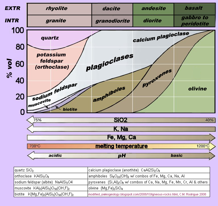
Something that might help is a classification of igneous rock types by mineral composition (and the "recipes" for those minerals) along gradients of silicate (SiO2) abundance, alkali dominance measured by sodium (Na) and potassium (K) abundance, and abundance of ferro-magnesian minerals. This chart also shows gradients of temperatures at which these minerals "freeze" out of magma and their acidic-basic balance. Mars doesn't have rocks as elaborately fractionated as Earth does, what with the absence or very temporary experience of plate tectonics, but it does show at least a partial differentiation of rocks along the trajectory taken so much further by Earth. http://www.csulb.edu/~rodrigue/geog400/rockcompositions.jpg.
So, where on this chart do you see minerals having three of the elements that dominate the chemicals with high positive loadings on PC1? On Earth, they tend to accumulate more toward the crust or more in the mantle?
______________________________________________________________________________

______________________________________________________________________________
______________________________________________________________________________

______________________________________________________________________________
Component 2
Now, analysis of your first primary component done, turn your attention to the second one. The loadings on this second component are necessarily lower than those on the first one. What the second component does is account for the variability in the data set that is not accounted for by the first component. Is there one or more variables that load relatively highly on this second component that, ideally, did not load very highly at all on the first one? If so, we may have found some second underlying factor that accounts for another key dimension of variability in your data set.Did anything load highly in a positive direction on the second component? What is it, and where does its non-silica element seem to show up on the rock composition chart? Is it more abundant in crustal or mantle rocks?
______________________________________________________________________________
Which chemicals loaded highly in a negative direction on this component? What is the one odd feature they all share but which makes them all different from all the other chemicals you've been looking at? What are they all missing?
______________________________________________________________________________

______________________________________________________________________________ ______________________________________________________________________________
That leaves us with one other critter loading highly in a negative direction on PC2. It is really odd in the sense that it is predominantly found in the cores of planets and differentiated (melted and gravity-layered) asteroids (very "siderophilic" element). What is that element? Why do you suppose it pops up in these readings? A look at the Spirit itinerary and the surface the rover traversed might be suggestive.
______________________________________________________________________________

______________________________________________________________________________
Component 3
Finally, we come to principal component 3. Not a whole lot loads highly on this puppy, but two of the chemicals do, one positively and one negatively and both really highly, too. Identify the chemical loading crazy high on the positive side on this component.______________________________________________________________________________
______________________________________________________________________________
______________________________________________________________________________
The Goldschmidt geochemical scheme that might help here is discussed at http://en.wikipedia.org/wiki/Goldschmidt_classification. It organizes the classic periodic table of the elements into affinity groups having to do with siderophile elements (those that like to hang out with iron and, so, wound up being gravitationally pulled to the center of the earth and Mars during melting and differentiation of the early planets. Others are chalophilic (liking to hang out with sulfur, not as dense as the siderophiles and so pushed out just beyond the core during differentiation). Lithophiles are the elements that love to bind up with silicate to form rocks. Being less dense, they were displaced toward the surface of the planet, where they dominate the mantle and really dominate the earth's crust (but are nowhere near so dominant on Mars' crust). Then, there are the (irrelevant to this exercise) atmophiles, the gasses that outgassed from the differentiating earth and Mars and built up in planetary atmospheres. To confuse things a bit, the Goldschmidt classification does not map onto the actual core-mantle-crust structure and individual elements can form compounds that might have affinities with more than one class (e.g., iron -- it forms siderophile, chalcophile, and lithophile minerals).
So, what seems to be the polarity that principal component 3 is picking up on? What kind of element is the strongly negative loading critter (interestingly, it also shows up in a lot of places with chlorine and bromine, but I digress)? What about the strongly positive loading one?
______________________________________________________________________________ ______________________________________________________________________________
Visualization
Now we can have some fun with the results of our PCA. Well, at least I did, anyway!
The Chemicals
You're going to build compound X-Y charts in Calc of the actual minerals that loaded highly on each of the three principal components, resulting in four graphs. The first graph will show the reading for each sol of the five chemicals loading highly in a positive direction on PC1. The second will show the reading for the four chemicals loading highly in a negative direction on PC1 (I didn't want you to put all nine PC1 chemicals on one graph, as it would be a real mess). Then, you'll do the four chemicals loading highly (both positively and negatively) on PC2 and then the two measly chemicals loading highly on PC3.To do these, highlight Column A or SOL by clicking the grey box above it. Hold down the Control key and then click each column with a chemical loading highly on the component you're graphing. You'll be clicking anywhere from two to five of these columns for each graph. Then, click the graph icon. Select Line and hit Next. Make sure the Columns default is clicked and hit Next again and again. Yes, it's pretty distressingly ugly at this point -- don't worry about that yet. Click Titles and put in something to name your graph (e.g., "Principal Component 1: High Positive Scores" and maybe list those chemical symbols). For X variable, put in Sol. For Y variable something like "Parts per 100 or million." Then, hit Finish and up comes your graph in some inconvenient location. Move it wherever you like (I inserted a new worksheet, then went to the main data, highlighted the graph, hit Control-X, touched the new sheet tab, and hit Control-V to move the graph onto a separate sheet. Alternatively, you could put them below your original data. Just someplace out of the way, because there are going to be a bunch of graphs).
Sure is ugly, ain't it? Not to worry. Double-click somewhere on the Y axis, then click Positioning and then click the box next to Cross other axis at and select Start. That will move the X axis label down to the correct position! You might want to click Numbers and unclick Source format and then pick the Decimal places Option for one decimal place, something to make it less cluttered.
A couple of these graphs are still going to look just awful. You have some chemicals measured in percentages and others in parts per million and pretty much most of them have a couple orders of magnitude difference between chemicals. What you get is a curve or two way up above the X axis that looks nice and variable and then a blur running along the X axis so you can't even see their variations. Double-click the Y axis again and the Scale tab and then click "Logarithmic scale." Your Y axis will now increment in orders of 10 and look a lot nicer. Since some of the chemicals will have logged abundances under 1, it is very important to change the scale's automatic start of 1 to something like 0.01 or even 0.001 or those guys will completely disappear from your graph. There is no log 0 but you can get logs close to zero so play with the scale to capture those. Calc may bug you about a couple of these because there are some actual zero readings for some chemicals and ... there is no such thing as Log-0. But it handles the situation pretty well, basically blanking out those sols.
You can play around with the color of the chart background and of the lines and I recommend you do, working on your data visualization signature style.
The Principal Components
Now, let's do a single chart of all three principal components, which you had saved as regression variables back in SPSS. This time, highlight Column A and then click on each of the columns for PC1, PC2, and PC3. Follow the directions above and create your chart. You don't want to turn the Y axis into a logarithmic one this time, but you might want to format those numbers to 0 or 1 decimal place to declutter it. You should check that the X axis labels are aligned vertically, too.So, you can start to see the zonation pattern here. There are places where PC2 is the highest curve, other places where it's PC3, and finally places where PC1 is the highest and where all three components are going ape (really extreme variability). You need to be careful here, though. The X axis is deceptively evenly marked off by sols, but remember that Spirit doesn't take one spectrum every single sol. There are sols it's just boogieing from one place to another and other sols it's collecting data. So, the time dimension along the X-axis is very spotty and irregular, despite what the axis graphically implies.
From PCA to the Geography of Geology!
Let's now attempt a zonation of Spirit's travels, with the understanding that distance is only loosely linked to duration of journey (Spirit is sped up at one point and then might spend many sols working over one rock) and the nature of the terrain is reflected to us through the interests of the team and the rocks they pick to analyze. With those caveats, we can attempt a crude zonation. Eyeballing that chart of the three principal components, pay attention to which one is on top and which on the bottom and when/where the transitions in dominance occur.
It can be tricky. You have to avoid the tendency to see high values as high in abundance and low values as low in abundance. What you're trying to pick up on is divergence from neutral or zero. A principal component is kind of like a see-saw: If it swings to one side of neutral, it's like all the chemicals loading highly on that side are abundant. You can have high divergence in the positive, upward direction, which means the high positive loading chemicals on the affected component are abundant. You can also have high divergence in the negative, downward direction, which means the high negative loading chemical in that component are abundant.
Coarse Scale Zonation
Let's start at the coarsest scale by dividing Spirit's trip into three segments, one in which PC1 is the lowest curve and PC2 is the highest, one in which PC2 is the lowest and PC 3 is (mostly) the highest (but not too impressively), and one in which PC3 is (mostly) the lowest and PC1 is (mostly) the highest and all three curve fluctuate dramatically.You can do this in Calc by clicking on the Drawing icon right next to the Chart Wizard icon you've been using all along (looks kind of like a pencil with an eraser and a line coming out of it). When you do, a toolbar appears, probably on the bottom of the Calc window. If you click on the "\" icon, you activate the line drawing function. Double-click your chart to activate it for editing and then click on the line tool (which looks like a /). Then, click your chart as closely as you can to the point where PC1 gives way to PC2 as the minimum curve and then drag the line that appears straight down to the X axis and, when it's nice and straight, let go. Do the same where PC2 gives way to PC3 as the minimum curve. You now have the transect divided into three regions.
At this point, note the rough sol at which the two transitions happened. Be very aware that you can't assume that one tick mark is one sol and count up and down from an axis date. To get the exact sol at which a transition took place, you can pass your cursor over one of the three data dots for that sol, and a little box will float up identifying the data point by sol (as well as value).
Take those two dates over to the map below to get your bearings.
![[ map of Spirit's itinerary in Gusev Crater ]](http://mars.nasa.gov/mer/mission/tm-spirit/images/MERA_A1457_2_br2.jpg)
What is Spirit doing during the first segment? What kind of terrain is it crossing? Which chemical had a high positive eigenvalue on the principal component that has the highest scores on this segment? Which chemicals generated the lowest eigenvalues on the principal component with the lowest scores on this segment (meaning they're abundant, too)? What kind of rock are we talking about here? You might look at that rock composition chart again.
______________________________________________________________________________

______________________________________________________________________________

______________________________________________________________________________
You can get a better idea about what's going on by looking at the rover's course projected onto one of Spirit's PanCam navigational images here at http://marsrover.nasa.gov/mission/tm- spirit/images/sol_572_in_sol149Pan.jpg. What is the feature that dominates this region of the trip?
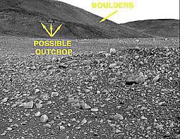
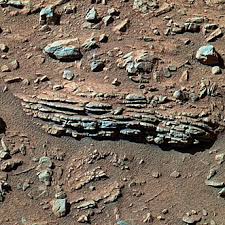
Look more closely, and you'll see faint beddedness on the slope of this area going from upper right to lower left. You can see the effect better here: http://www.fas.org/irp/imint/docs/rst/Sect19/04-JR-04-outcrop-380- 295.jpg. Closer up: http://www.fas.org/irp/imint/docs/rst/Sect19/04-SS1-04- Color_Rock-512.jpg. Beddedness can imply what kind of landscape process? You can see why Team Spirit made a beeline for the Columbia Hills (named for the crew of the Columbia), given their selection of Gusev to hunt for signs of water.
______________________________________________________________________________

______________________________________________________________________________

______________________________________________________________________________
What is going on during the third segment? The rover is going through very diverse terrain in the hills, with volcanic tephra, craters, weird concretions, rock veneers, and soils, producing all kinds of spikes in the data as the team has it sample all kinds of rocks and soil in a short distance.
______________________________________________________________________________

______________________________________________________________________________

______________________________________________________________________________
Finer Scale Features
Let's go back and look at some smaller scale features. Going back to Segment 1, check out the feature around sols 52 to about 65 or so, where PC2 blips up strongly and PC1 mirrors it by blipping down strongly. You have an unusual concentration of CaO (PC2), FeO, MnO, MgO, and Cr2O5 (PC1). What is that feature on the itinerary map?______________________________________________________________________________
______________________________________________________________________________

______________________________________________________________________________

______________________________________________________________________________
When you took your principal components chart over to the map of Spirit's wanderings, you could immediately see that PCA had pretty spot-on differentiated the flat, crater-punched basalt of the first 158 sols from the very different rocks of the Columbia Hills, with their intriguing concentrations of chemicals known to be associated with evaporites. It also picked out a very different and wildly variable terrain inside the Columbia Hills after its ascent up West Spur and around Wooly Patch. The third region coïncides with a long and looping climb up to the Larry's Lookout region and close examination of the PanCam image shows you the subtle color, texture, and orientation differences in the terrain of the third segment.
How might you interpret the Gusev landscape in terms of its geological history? The MER team thought Gusev had to have been a lake or sea or playa at some point in its past, what with the very suggestive Ma'adim Vallis seeming to pour into it and what look a lot like delta type deposits on the floor there. When Spirit landed and looked around, all they saw was basalt decorated with loose rocks and a lot of rust, which didn't exactly look like the floor of an ancient lake. So, Spirit headed off towards what looked like hills in the distance and found they were the raised rim of a crater. It hung a right and tore across for the Columbia Hills, where these tantalizing seemingly bedded deposits were exposed. The geochemistry changed and did seem to have something to do with at least playa evaporite processes. As it climbed into the hills, it found all kinds of wildly varying rocks and dirt and geochemically-distinct veneers on rocks, with the signal of wind-deposited materials.
Try to integrate these elements into a stages of landscape history scheme: First, this happened; then, that happened; and afterwards this other thing went on. You're trying to figure out why the evaporite signal is up, in the Columbia Hills and the basalt signal is down in the floor of Gusev, basically. When you write this history, be sure to focus on the landscape itself -- what happened to the landscape at different times? Do NOT focus on the wanderings of Spirit itself!!!
______________________________________________________________________________ ______________________________________________________________________________ ______________________________________________________________________________
You would simply not have been able to do this kind of regionalization if you slogged through individual chemical data. Despite the weirdness of the multidimensional dataspace that PCA works with, it really does reduce the complexity of the spatial problem facing you. I hope you enjoyed this little foray to Mars as much as I did and feel comfortable with PCA for some of your future multivariate analytic needs!
Data Dictionary
I decided to pull the metadata out of gusev.ods, so that you have less to worry about in getting the spreadsheet into SPSS. It might be helpful to know what the variables are and how they're measured, though. Here you go:
Na2O -- sodium dioxide -- (weight percent)
MgO -- magnesium oxide or magnesia -- (weight percent)
Al2O3 -- aluminum oxide or alumina or aloxite -- (weight percent)
SiO2 -- silicon dioxide or silica -- (weight percent)
P2O5 -- phosphorous pentoxide -- (weight percent)
SO3 -- sulphur trioxide or sulfur trioxide -- (weight percent)
Cl -- chlorine -- parts per million
K2O -- potassium oxide -- (weight percent)
CaO -- calcium oxide, lime, or quicklime -- (weight percent)
TiO2 -- titanium dioxide -- (weight percent)
Cr2O3 -- chromium (III) oxide or chromium sesquioxide or chromia -- (weight percent)
MnO -- manganese oxide -- (weight percent)
FeO -- wüstite or ferrous oxide or ferrous iron -- (weight percent)
Ni -- nickel -- parts per million
Br -- bromine -- parts per millionData adapted from:
Gellert, R.; Rieder, R.; Brückner, J.; Clark, B.C.; Dreibus, G.; Klingelhöfer, G.; . Lugmair, G.; Ming, D.W.; Wänke, H.; Yen, A.; Zipfel,J.; and Squyres, S.W. 2006. Alpha Particle X-Ray Spectrometer (APXS): Results from Gusev crater and calibration report. Journal of Geophysical Research (Planets) E02S05, doi: 10.1029/2005JE002555,2006.
GEOG 400/500 Home | GEOG 400/500 Syllabus | Dr. Rodrigue's Home | Geography Home |
This document is maintained by Dr.
Rodrigue
First placed on Web: 03/26/08
Last Updated: 10/10/23