
The human visual system is most sensitive to green light. The eye/brain system whereby we perceive color works counter to this sensitivity, so we do not perceive green to be brighter than other colors. It is impossible to see the green component in white and mixed colors, and thus very difficult to conceptualize the relationship of color to brightness.
A graph of the human sensitivity to brightness has a bell shape in relation to the spectrum. Even though the curve is not symmetrical, it has a definite and pronounced center in the green wavelengths. This center can be clearly seen when light is bent through a prism. When the spectrum is only partially spread, white light appears in the center, with cyan gradating to blue on one side and yellow gradating to red on the other. Green is the only spectral hue not to appear in the partially spread spectrum As you spread out the spectrum, green is the last to be separated and the last to appear.
As you watch the spectrum spreading out you can perceive the relationship of your own sensing mechanism to the physical stimulus. You are seeing the bell curve from the 'inside'. The prism spreads the frequencies of light on the x axis, and your visual system sees brightness on the y axis.
This relationship is usually hidden and invisible, but spreading the spectrum out in stages reveals the relationship of hue to brightness in a dramatic way.
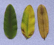
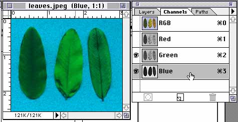
Artists and students have no way of perceiving or understanding the unequal proportions of RGB in white. The large amount of green light in colors that appear tan, brown, pink or even sky blue does not seem logical or even possible. I use the example of a green leaf, a yellow leaf, and a brown leaf placed on a scanner and made into a PICT file in RGB.
Most mammals see in monochrome with a single receptor that is most sensitive to green. One would expect that this receptor would be useful in finding green leaves to eat, but such is not the case.
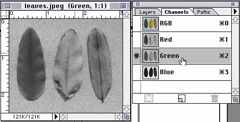
If we look at the RGB channels of the leaf image, we see that the yellow and brown leaves are brighter in the green channel than is the green leaf. If we combine the green and blue channels, we see the yellow leaf as the greenest, as someone trained in color would expect, but even the brown leaf is more green than the green leaf!
If we look at the red channel we see that the green leaf is very dark in that channel, and the yellow and brown leaves are bright.
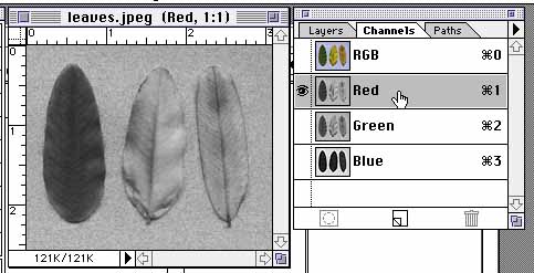
It is necessary to have a red receptor signal "not red" to distinguish the green leaf from the brown leaf, and to distinguish green from white. Scientists and artists who have worked creatively with light, understand that the yellow leaf is reproduced on the screen with red and green light, but few people can appreciate that even the brown leaf in RGB has as much green component as red. The sensation of green color is not produced by the presence of green light, but by the absence of red light.
Not only that, but the green channel itself must be quite a bit less than 100% brightness for us to perceive a green that we would associate with leaves and other green objects from nature. The green light of the RGB system appears to the eye as a yellow-green because of its intensity. Green at 50% and 100% brightness compared side by side appear to be different hues rather than different values of the same hue.
I propose that the predominance of green light in the sensation of white establishes a hue for white. "White is Green" is a useful concept for establishing the place of white in the spectrum. The hue of a color is determined by its place in the spectrum, and white is in the same place in the spectrum as green. The chart of color temperature is usually shown as white shading to red at the low end and blue at the high end. But the color temperature of light is also a spectrum. As the light source increases in temperature, the color shifts from red to white because the amount of green light increases. When green predominates, we see white. At a higher temperature, blue predominates and we see the light turning blue-white. The holy grail of a perfect white is achieved when green predominates and the amount of red and blue on either side of green are in balance.
When color is specified in the HSV system (hue, saturation and value), the tiniest difference in hue of the RGB components is enough to define the hue of the color. For white, the relative brightness of RGB are all 100%, but the absolute brightness are different. In order to produce white and grays, green must be the predominant hue in the absolute brightness of the RGB component colors.
Another method of determining a hue for white is to make a sample square of the three component colors of RGB on the computer screen. Each of these samples will indicate 100% brightness in the color picker. Now set the monitors to display grayscale. The different brightness values of red, green and blue become dramatically apparent. In the RGB system the maximum values of red, green and blue are adjusted so that the combination of the three colors will produce white. The amounts of the three component colors are not equal. Red is 30% of white, green 59%, and blue 11% Each of the three component colors is then divided into 100 percentage steps or 256 digital steps so that white is defined as 100% of red, green and blue. The RGB system depends on a calibration to match human vision so that equal percentage settings of RGB values produce pure grays and white. A hue composed of the percentages of RGB represented by their gray values is definitely green by the definition of hue, even if its appearance is white.
If you stand at the back of a typical student computer lab, you will see markedly different white backgrounds on every screen. Each student, however, will perceive his own screen to be white unless the calibration is extremely far off. This adaptation of the human eye to accept the light source as white makes calibration by eye extremely difficult.
The goal of color systems is to create a uniform color space. The hue/value relationships are adjusted by the scientist using precise measuring instruments so that the user can deal only with hue relationships. This is very useful up to a point, but the usefulness breaks down when the hue/value relationship changes from one display device to another. The gradation of each of the RGB components is set so that equal numerical settings for RGB will yield a pure gray. Unfortunately, this calibration will create other hues that are not equal in brightness.
The human visual system is optimized for perceiving hues. We can see quite tiny hue differences, so the task of matching colors to the satisfaction of humans is an endless scramble.
Look a typical spectrum of colors in a 'color picker'. Hues of equal saturation are in a straight line. Imagine the task of charting a line, solely by observation, that represents 50% brightness. It is very hard for even a trained artist to do. This line moves up and down on the y axis and is only traced with careful comparison and bracketing using a grayscale for measuring.
I have created the Percept Color Chart that displays hues along the X axis and values on the Y axis. The Chart is on the home page of this site.
It was presented at Color '97 in Kyoto
Each fully saturated hue is in a different place on the y axis. On this chart equal value hues are on the same line on the y axis. Look at the task of tracing hues of maximum saturation on this chart. It is very easy to do because our visual-perceptual system is optimized for just that task.
Hue in the RGB system is described in a circular arrangement with hues designated as degrees of a circle. Unfortunately the traditional relationships of opposites, analogous and triadic colors do not yield what an artist would call harmonious color because the value differences are much greater in the RGB system.
I have arranged the Percept Color Chart into a color wheel so that the radial axis is a gradation from black in the center to white at the outside. There are three steps of hue, corresponding to the primary, secondary and tertiary colors of the artist's color wheel. There are 10 steps of value because graphic arts grayscales are done in 10% steps, and blue is close to 10%, red is at 30% and green is very close to 60%, so the pure hues match the steps of the scale. Each pure color has a different place on the radii from the center black 0% to the outside white 100%. The radial arrangement of colors was first used by Newton, and is still used to select hues in RGB, so the wheel arrangement might make the Percept system easily accessible to more users.
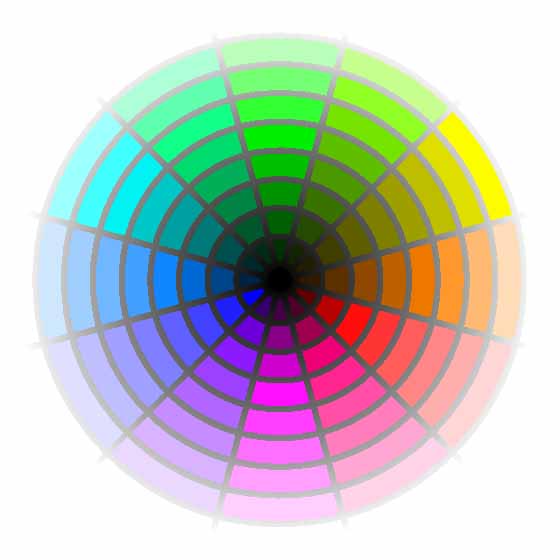
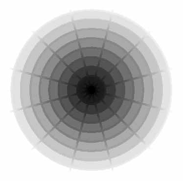
In the traditional color wheel, yellow is the brightest pure hue, so yellow is at the top of the wheel. In the Percept Color Wheel, green (in its highest value of white) is the brightest hue, so it is at the top of the wheel. When the colorwheel is shown on a grayscale monitor, it displays as a grayscale of concentric circles. Each ring of the circle is the same value of gray. When the same circle is converted to grayscale using conversion algorithms, the results vary considerably. Blue is usually lightened, sometimes to as much as 25% gray. On some grayscale laser printers the circles are a uniform gray, on others the blue is lightened.
Undoubtedly the hue/value relationship is not the only problem in calibration of different devices, but it is certainly a major problem. The end user has no way of seeing what is being done to this particular relationship when calibrations are altered. I am hoping that the Percept chart and color wheel will give users a handle on this important aspect of color display and some intuitive tools to adjust colors to achieve their desired result.
The Percept color chart and color wheel also allow the user to select colors that are harmonious in the same way as colors are harmonious in the artist's red yellow blue color wheel. I believe the traditional artist's color wheel works because it is adjusted to limit the value differences between hues. In the RYB color wheel there is only a single gradation of value from yellow at the top to purple at the bottom. Colors opposite each other in the horizontal plane are of almost equal value. Unfortunately, the artist's color wheel does not work with the maximum saturation of hues available even in pigment form. Large numbers of possible colors are left out. The opposites in RYB do not correspond to either the artist's definition of opposites as colors that mix to produce gray, or the scientist's definition of opposites as afterimage colors.
In the Percept system, opposites can be chosen with any desired value relationship. The wheel is useful for selecting opposites, triads and analogous colors.
The rectangular chart is preferred for describing color as light/dark and warm/cool. The chart seems to work better as an intuitive tool for selecting color. What I have found teaching computer graphics is that students using the standard color picker will use hues of maximum intensity. When students are given the Percept Color Chart without explanation, they will select colors with less intensity and intuitively arrive at compositions with closer value relationships.