Computers have put a vast and powerful palette of colors into the hands of millions of people. The results have not been gratifying. It often seems that novice users want to use all the 16 million colors in a single graphic.
This research seeks to understand the differences between artist's color and computer color in order to suggest ways that computer art can incorporate the harmonies and subtleties found in traditional art.
The traditional artist's color wheel defines the primary colors as red yellow and blue. We will call this system RYB.
Photography defines the primary colors as cyan, magenta and yellow. Computers and video use the primary colors of light, which are red, green and blue. The RGB of video can create CYM by addition and the CYM of film can create RGB by subtraction. The RGB and CYM hues are in theory complimentary and reciprocal. In practice, film, video, computer screens and printing all have different 'gamuts' or ranges of color that can be created. For that reason, the colors you see on the screen do not match what comes out of a color printer.
Cyan, magenta and yellow used by printers have a much smaller range of hues and values as dyes used in photography, so printers add black to increase the value range of their colors. The primaries however are the same hues, so we will define the system that includes computers, video, printing and film as CYM/RGB
The difference between the computer palette and the colors used by artists is one of the unexplained questions of color theory. Usually artists will answer that these are "different systems," but that does not explain how either of them operates.
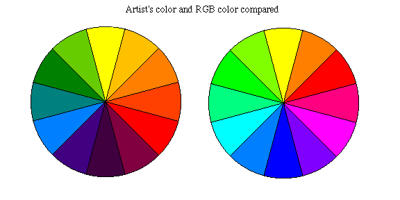
Diagram 1 shows both systems divided into 12 step circles. This is way the artists lay out colors in a color wheel. The hues are further grouped into primary, secondary and tertiary colors.
Seeing the two systems side by side can help explain their differences. In RYB, red is in the 4 o'clock position and blue is in the 8 o'clock position. This forms a triangle of the red, yellow and blue primary colors. In the CYM/RGB system, the primary colors of cyan, magenta and yellow occupy the same positions as red, yellow and blue in the RYB.
In CYM/RGB, magenta is in the 4 o' clock position in place of red. Red is at 2 o'clock, only two steps from yellow instead of four. In CYM/RGB, red is created by mixing (subtracting) yellow and magenta. In photography and printing, red is a secondary color, made from magenta and yellow. Until recently, only film and printing inks could make a pure red by subtraction, but now cyan, magenta and yellow are available as inks and gauche that can be used to mix red, blue, and all the other colors that color printing and photography can create.
Green, yellow green, and yellow are in the same position in both systems, so that means that there are fewer steps between blue and green in the RYB system.
In the RYB system, red and blue are mixed (subtracted) to make purple. There is very little overlap in the spectral energy distribution of red and blue, so the subtraction of the two hues yields a very dark purple. Magenta is the same hue, but is a much higher value. Magenta contains red and blue light at full strength, so both red and blue can be subtracted from magenta. The colors on either side of magenta also have a much higher value in CYM/RGB, making it possible to mix many violets and red/violets not possible in RYB. Compare magenta at 4 o'clock in the CYM/RGB system with purple at 6 o'clock in the RYB system. It is hard to believe, but these are same hues but at different values.
Second difference: The RYB subtracts red and blue to make purple. CYM/RGB subtracts from magenta to make both red and blue.
Ostwald, who defined color on a scientific basis, defined opposite colors on the colorwheel as the afterimage of the color. By this definition, blue is the opposite of yellow. Itten wrote the most popular book on artist's color. He said that Ostwald's definition was not useful for artists. Itten insisted that blue was the color that mixed with yellow to make green. In the CYM/RGB system, when yellow and blue are mixed (subtracted) the result is black.
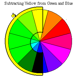
Diagram 2 shows the blues of the CYM/RGB mixed with yellow. Blue at 6 o'clock in this system mixed with yellow yields black. Cyan at 8 o'clock and yellow yields a bright green. At 7 o'clock is an in-between cyan/blue that yields a darker green. Both greens are the same hue, but the mix at 7 o'clock is a much lower value. This point is very important. This darker green looks more like the green in artist's paint sets. In the artist's RYB system, blue is usually defined as a hue opposite orange rather than the opposite of yellow. This blue yields a dark green or even a gray-green in some pigments when mixed with yellow.
In the RYB system there is one step between blue and green, and Itten calls this hue turquoise in his description of artist's color. Because it is created by the subtraction of yellow and blue, this turquoise is a much lower value than cyan. Cyan used in film and ink contains the entire spectrum of green and blue. It can be used to mix (subtract) a very bright green and bright blue, which turquoise cannot. The difference is so dramatic that most observers would say the two (cyan and turquoise) are different hues.
Understanding the relation of color to value is the key to understanding the difference between computer color and artist's color. The difference in value between cyan (85%) and turquoise (47%) is 38%. The difference between magenta (54%) and purple(14%) is a whopping 40%. These are the same hues, but different values in the two systems
CYM/RGB is a system that can create a great range of hues and values. There are several reasons to consider it the "correct" system, and the RYB system incorrect.
CYM/RGB can be used to create all the hues and values of RYB, but not vice-versa. RYB misses vast ranges of hues and values; especially violets, bright greens, and blue-greens.
Opposite colors in CYM cancel each other out to create black, and in RGB, the primaries combine to create a pure white. Equal amounts of three CYM/RGB colors create very pure grays, almost impossible to create in RYB. In RYB all three colors together create brown.
After all this is said, the fact still remains that when the power of computer colors gets into the hands of students and computer artists, the colors they choose are usually godawful. RYB colors can also be misused, but artists who use the RYB color wheel in the traditional way to pick complimentary pairs and triads will have much more pleasing results. The goal of this investigation is to understand what is "right" about the RYB system.
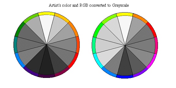
Diagram 3 shows the RYB and RGB/CYM color wheels converted to grayscale. The RGB/CYM color wheel contains all pure colors that are defined as 100% brightness in the color picker. As you can see, the primary colors of light (color phosphors) built into the picture tube of computer monitors and television sets actually have a light value of red (46%), green (80%) and blue (25%). If you look at the pure hues in the color picker, they will all be listed at 100% brightness, and will all have their intensity set to the maximum at 255. Notice how green appears very bright on the computer, much brighter than red. In artist's colors, red is usually the same value as green or slightly brighter.
The subtractive primaries of cyan (85%), magenta (54%), and yellow (95%) have more brightness than RGB because they are each composed of two of the RGB primaries of light illuminated at full strength.
The RYB wheel shows gray values that are much closer together. Opposite colors and adjacent colors are very close in value. The blue and green colors are darker, as we discussed above. There is an almost uniform light-to-dark contrast from yellow at the top of the wheel to dark purple at the bottom. This reduces the value contrast between opposite and triadic compliments, creating pleasant harmonies.
These two gray wheels allow one to visualize the differences between the two systems very graphically. By understanding the relationship of color and value it will be possible for artists to control the extremes of value differences in computer color and approach the close harmonies of traditional paint.