PPA 696 RESEARCH METHODS
UNIVARIATE DATA ANALYSIS
Why Univariate Statistics
How to Analyze One Variable
Frequency Distribution
Grouped Data
Cumulative Distributions
Percentage Distributions
Why Graph
Bar Graphs
Histograms
Frequency Polygons
Pie Charts
Rates and Ratios
Why Univariate Statistics?
Univariate analysis explores each variable in a data
set, separately. It looks at the range of values, as well as the central
tendency of the values. It describes the pattern of response to the variable.
It describes each variable on its own.
Descriptive statistics describe and summarize data.
Univariate descriptive statistics describe individual variables.
How to Analyze One Variable
1) Raw Data
Obtain a printout of the raw data for all the variables.
Raw data resembles a matrix, with the variable names heading the columns,
and the information for each case or record displayed across the rows.
Example: Raw data for a study of injuries among county
workers (first 10 cases)
| Injury Report No. |
County Name |
Cause of Injury |
Severity of Injury |
| 1 |
County A |
Fall |
3 |
| 2 |
County B |
Auto |
4 |
| 3 |
County C |
Fall |
6 |
| 4 |
County C |
Fall |
4 |
| 5 |
County B |
Fall |
5 |
| 6 |
County A |
Violence |
9 |
| 7 |
County A |
Auto |
3 |
| 8 |
County A |
Violence |
2 |
| 9 |
County A |
Violence |
9 |
| 10 |
County B |
Auto |
3 |
It is difficult to tell what is going on with each variable
in this data set. Raw data is difficult to grasp, especially with large
number of cases or records. Univariate descriptive statistics can summarize
large quantities of numerical data and reveal patterns in the raw data.
In order to present the information in a more organized format, start with
univariate descriptive statistics for each variable.
For example, the variable Severity of Injury:
| Severity of Injury |
| 3 |
| 4 |
| 6 |
| 4 |
| 5 |
| 9 |
| 3 |
| 2 |
| 9 |
| 3 |
2) Frequency Distribution
Obtain a frequency distribution of the data for the
variable. This is done by identifying the lowest and highest values of
the variable, and then putting all the values of the variable in order
from lowest to highest. Next, count the number of appearance of each value
of the variable. This is a count of the frequency with which each value
occurs in the data set. For example, for the variable "Severity of Injury,"
the values range from 2 to 9.
| Severity of Injury |
Number of Injuries with this Severity |
| 2 |
1 |
| 3 |
3 |
| 4 |
2 |
| 5 |
1 |
| 6 |
1 |
| 9 |
2 |
| Total |
10 |
3) Grouped Data
Decide on whether the data should be grouped into classes.
The severity of injury ratings can be collapsed into
just a few categories or groups. Grouped data usually has from 3 to 7 groups.
There should be no groups with a frequency of zero (for example, there
are no injuries with a severity rating of 7 or 8).
One way to construct groups is to have equal class
intervals (e.g., 1-3, 4-6, 7-9). Another way to construct groups is to
have about equal numbers of observations in each group. Remember that class
intervals must be both mutually exclusive and exhaustive.
| Severity of Injury |
Number of Injuries with this Severity |
| Mild (1-3) |
4 |
| Moderate (4-6) |
4 |
| Severe (6-9) |
2 |
| Total |
10 |
4) Cumulative Distributions
Cumulative frequency distributions include a third column
in the table (this can be done with either simple frequency distributions
or with grouped data):
| Severity of Injury |
Number of Injuries |
Cumulative frequency |
| 2 |
1 |
1 |
| 3 |
3 |
4 |
| 4 |
2 |
6 |
| 5 |
1 |
7 |
| 6 |
1 |
8 |
| 9 |
2 |
10 |
A cumulative frequency distribution can answer questions
such as, how many of the injuries were at level 5 or lower? Answer=7
5) Percentage Distributions
Frequencies can also be presented in the form of percentage
distributions and cumulative percentages.
| Severity of Injury |
Percent of Injuries |
Cumulative percentages |
| 2 |
10 |
10 |
| 3 |
30 |
40 |
| 4 |
20 |
50 |
| 5 |
10 |
70 |
| 6 |
10 |
80 |
| 9 |
20 |
100 |
Why Graph? Graphing the Single Variable
Graphing is a way of visually presenting the data.
Many people can grasp the information presented in a graph better than
in a text format. The purpose of graphing is to:
-present the data
-summarize the data
-enhance textual descriptions
-describe and explore the data
-make comparisons easy
-avoid distortion
-provoke thought about the data
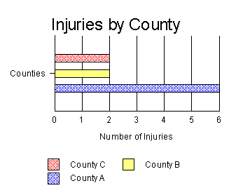
Bar Graphs
Bar graphs are used to display the frequency distributions
for variables measured at the nominal and ordinal levels. Bar graphs use
the same width for all the bars on the graph, and there is space between
the bars. Label the parts of the graph, including the title, the left (Y)
or vertical axis, the right (X) or horizontal axis, and the bar labels.
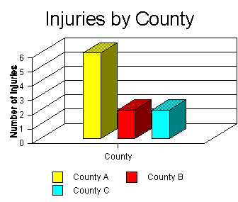
Bar graphs can also be rotated so that the bars are parallel to the
horizontal orientation of the page. For example,
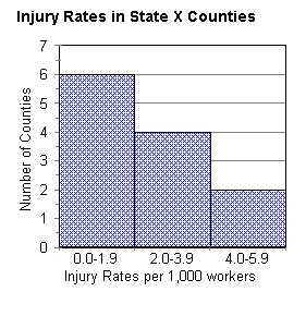
HISTOGRAM
A histogram is a chart that is similar to a bar chart,
but it is used for interval and ratio level variables. With a histogram,
the width of the bar is important, since it is the total area under the
bar that represents the proportion of the phenomenon accounted for by each
category. The bars convey the relationship of one group or class of the
variable to the other(s).
For example, in the case of the counties and employee
injuries, we might have information on the rate of injury according to
the number of workers in each county in State X.
| County Name |
Rate of Injury
per 1,000 workers |
| County A |
5.5 |
| County B |
4.2 |
| County C |
3.8 |
| County D |
3.6 |
| County E |
3.4 |
| County F |
3.1 |
| County G |
1.8 |
| County H |
1.7 |
| County I |
1.6 |
| County J |
1.0 |
| County K |
0.9 |
| County L |
0.4 |
If we group the injury rates into three groups, then
a low rate of injury would be 0.0-1.9 injuries per 1,000 workers; moderate
would be 2.0-3.9; and high would be 4.0 and above (in this case, up to
5.9). This could be graphed as follows:
FREQUENCY POLYGON
A frequency polygon is another way of displaying
information for an interval or ratio level variable. A frequency polygon
displays the area under the curve that is represented by the values of
the variable. This type of chart is also used to show time series graphs,
or the changes in rates over time.
For example, the following table shows the average
injury rate per 1,000 employes for counties in State X for the years 1980
to 1990.
| Year |
1980 |
1981 |
1982 |
1983 |
1984 |
1985 |
1986 |
1987 |
1988 |
1989 |
1990 |
| Rate |
3.6 |
4.2 |
3.4 |
5.5 |
3.8 |
3.1 |
1.7 |
1.8 |
1.0 |
1.6 |
0.9 |

A cumulative frequency polygon is used to display
the cumulative distribution of values for a variable.
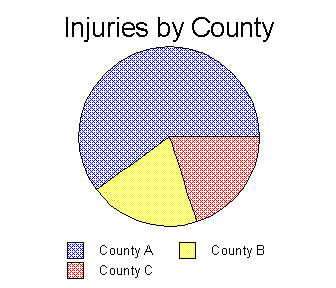
PIE CHART
Another way to show the relationships between classes
or categories of a variable is in a pie or circle chart. In a pie chart,
each "slice" represents the proportion of the total phenomenon that is
due to each of the classes or groups.
Rates and Ratios
Other ways to look at the sub-groups or classes within
one variable is by the relation of each sub-group or class to the whole.
This can be calculated with a proportion. A proportion is obtained by dividing
the frequency of observations counted for one group or class (written as
f) by the total number of observations counted for the variable
(written as N).
This can be expressed as f / N
A percentage is the same as a proportion, multiplied by 100.
This can be expressed as f / N x 100
A rate is the relationship between two different numbers, for example,
the number of injuries among county workers and the population of the county.
This can be calculated as the first number (N1, or injuries)
divided by the second number (N2, or population).
This can be expressed as N1 / N2
Many health statistics are expressed as rates, for example, the birth
rate is the number of births per some population, such as number of births
per 1,000 women.


