Gene Expression Microarrays
Part 1 - RNA to microarray slide picture
This paper is meant to talk about gene expression microarray data analysis. Specifically to talk about analyzing a two-color slide experiment, also called a diagnostic experiment. This is where you have two conditions, such as a control and a variable, on the same slide and you compare them. In the specific gene expression experiment I've been looking at recently, pituitary cells were examined upon exposure to either forskolin or a vehicle. Forskolin is a chemical that raises cAMP levels and activates the protein kinase A pathway.
So to make a gene expression microarray slide, we start of with our two populations of cells, one for each condition, and extract the RNA from them. We then use reverse transcription on the RNA to get cDNA, which we label with a marker, like Cy3 which fluoresces green or Cy5 which fluoresces red, the marker then adheres to the cDNA. We then take the two populations of differently labeled cDNA and apply it to the microarray slide. The slide has tethered to it different DNA nucleotide sequences at precise locations. The cDNA from the experimental cells and the DNA on the slide is allowed to hybridize, the complementary sequences binding to each other, and then washed to remove non-hybridized DNA. What we end up with is markers bound to the slide at specific locations based on nucleotide sequence, and varying in concentration based on the inital concentration of RNA. This can then be scanned to give use an image containing marker intensity at each location, which we can analyze as a spreadsheet or with specialized programs.
Part 2 - MA equations and plot
Next the raw numerical data that comes from scanning the image goes through some pre-processing steps. At this stage what we have are intensity values for the two different colors at each point on the slide. It's hard to interpret the data at this level, but one powerful visualization we can do to get an overall picture of the data is called an MA plot. This involves taking the ratio of the intensities, which we'll call M, and the amplitude of the combined intensity, which we'll call A, and scatter plotting the points on a log-log graph.
For each of the points we have:
R = intensity of red
G = intensity of green
M = R/G
A = sqrt(R*G)
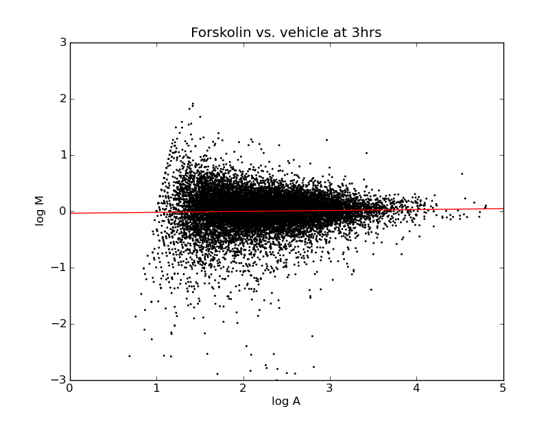
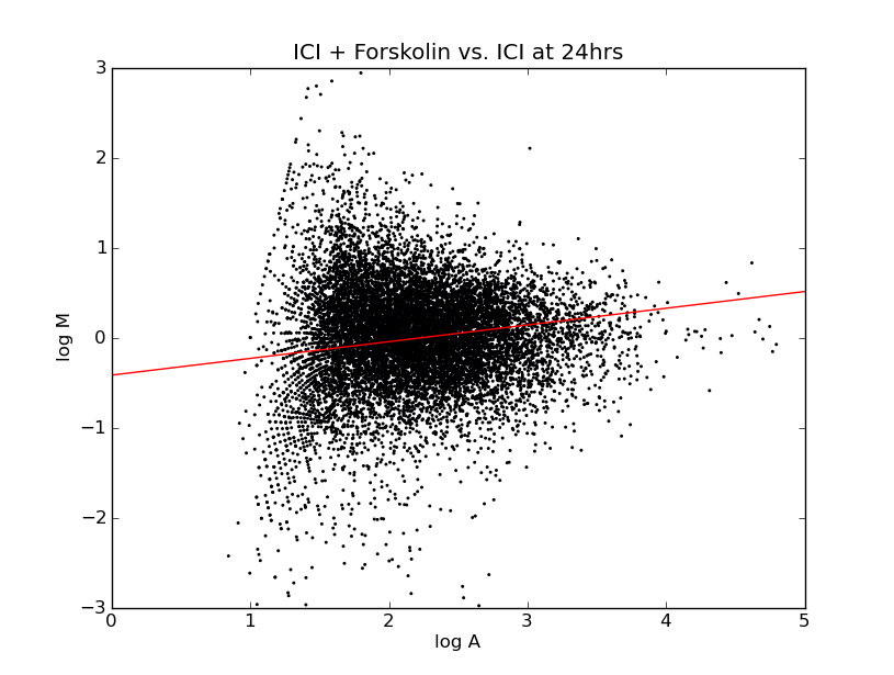
This gives you some overall view for how the ratio's are distributed. Particularly you want to look at whether they're distributed evenly across the horizontal axis because this represents whether we are seeing an even distribution of up-regulation and down-regulation. In a genome-wide microarray, such as this, although certain gene expression levels will change, we expect the overall amount of gene expression to be roughly the same.
If we see a difference, either toward greater gene expression or less, it could be the result of a bias in the preparation of one of the cell cultures causing that marker to be expressed more highly. The process of normalization works to offset systemic biases that might favor one cell preparation over the other. On these charts, the linear regression drawn through the points indicates that, even before normalization, the overall change in expression levels is about even between the two groups.
Part 3 - Null hypothesis, function, Students and ANOVA
An important part of any experiment is replication. To incorporate this, a microarray will use the same nucleotide sequences at different points in the array or in duplicate arrays. This way we get a number of readings for the expression level of each sequence. Based on these multiple data points we compile an average expression ratio, as well as a p-value. To demonstrate the importance of a p-value we can look at two data sets:
| Gene A | Gene B | |
|---|---|---|
| M1 | 1.8 | 1.0 |
| M2 | 1.9 | 1.5 |
| M3 | 2 | 2 |
| M4 | 2.1 | 2.5 |
| M5 | 2.2 | 3.0 |
| mean M | 2 | 2 |
| p-value | < 0.001 | 0.23 |
Although the average ratio change is the same for these two genes, the amount of variability in the measurements is very different, which comes out as a much higher p-value. To understand what the p-value represents you have to ask what the null-hypothesis is that it is testing. In this case the null hypothesis is “there is no statistically significant difference between these two cell groups.” So the p-value represents the probability that this is true based on the mean intensities, the standard deviation of the intensities, and the number of replicates.
There are a number of ways that you can calculate a p-value; the two that I have been focusing on are Student's t-test and ANOVA, two names you might recognize from papers. They both do essentially the same thing, in calculating the probability of the null hypothesis. The main difference is that Student's is the older method, whereas ANOVA is newer and expands the test to include more than two groups for comparison. In the case where you are only comparing 2 sets of values they should give the same answers.
Once you've compiled the replicates into an average fold ratio and a p-value, you have the basic form of the data to use for further analysis.
Part 4 - Filters and time points
Going back to the specific experiment of the effects of vehicle vs. forskolin on aT3 pituitary cells, I filtered the data to get two lists of genes. To get a list of up-regulated genes, I filtered for results where the average fold ratio was greater than 2 and the p-value was less than 0.05. Similarly for down-regulated genes, I searched for those with a fold ratio of less than 0.5 and p-value's of less than 0.05. But the experiment wasn't actually as simple as comparing vehicle vs. forskolin, rather it looked at the change in gene expression at three time points, t=3hrs, 6hrs, and 24hrs. To get a consistent view of the whole experiment, I made lists for genes that met those conditions at any of the given time points and combined them into one spreadsheet.
To look at the data, you can download a spreadsheet showing average ratios and p-values for the different time periods including up-regulated genes (n=36), down-regulated genes (n=10), or all genes (n= ~16,000).
Interpreting the Data
Once you have the data it is time to begin the next process of interpreting it. This is where you go from strict mathematical procedures and start using your knowledge of biology to understand what the numbers really mean. For more on this, continue here.